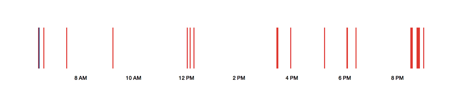
This is me searching on Google on June the 4th last year: Some queries before lunch, lots of queries after 8 pm.
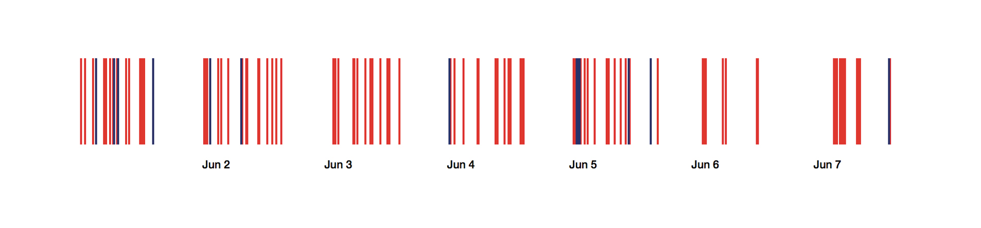
And this is me using Google Search in the week between the 1st of June and the 7th of June 2014:
Every one of these Google queries tells a little story about me: A search for advice, a quest for more knowledge, a hope for inspiration or reminder. On the 1st of March 2012 at 2.35pm, I typed in “Bloomberg” for the first time in my life – something that would result in an internship almost exactly one year later. And, apparently very desperate, I searched for the error “cannot read property of 0 undefined” on the 1st of October 2011 at 5.02pm; trying to understand Javascript for the first time of my life.
But when we climb up and look at all these Google search queries from further apart, we can see other narratives about a person’s life. We can see the bigger picture. A picture that is built out of these queries, but explains them at the same time. This blog post is about the insights out of my over 40,000 Google search queries between the 10th of June 2010 and the 19th of April 2015.
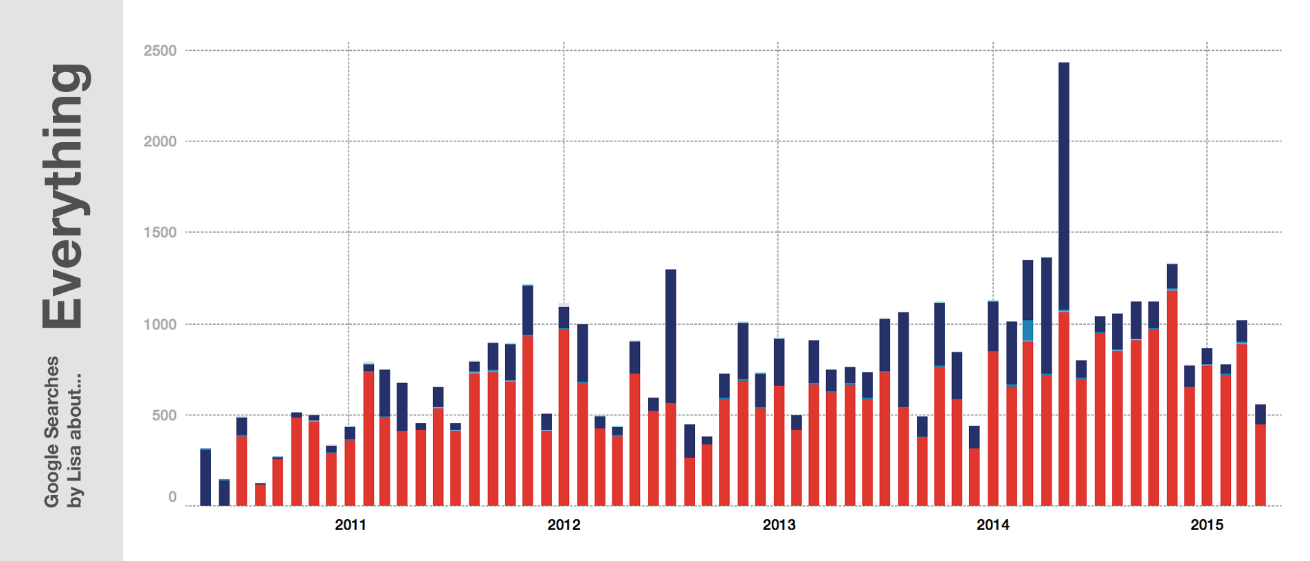
The spike in the last quarter of the chart? That’s me writing my Master’s Thesis: three magazines about “Making Money Online”. The deadline was in June 2014, and the week you can see at the top of this post is the week with the most search queries from the last five years.
Where does the data come from? Since April, you can download your entire Google search history easily. The queries come in JSONs, one per quarter, with Unix timestamps and tags: “isch” refers to Image search, “nws” to news search, “blg” to blog search (which I still used in 2010….but not anymore), etc. Google Maps queries are included, too, but come untagged. However, queries for directions can be easily found because of the included “->”; they look like this: “51.689585,-2.532349 -> Cheltenham, Gloucestershire, UK”. I downloaded the JSONs, merged them, sent them through Open Refine to get a CSV, used a formula to transform the timestamp to an Excel date and then used Tableau Public to have a look at the data:
Location
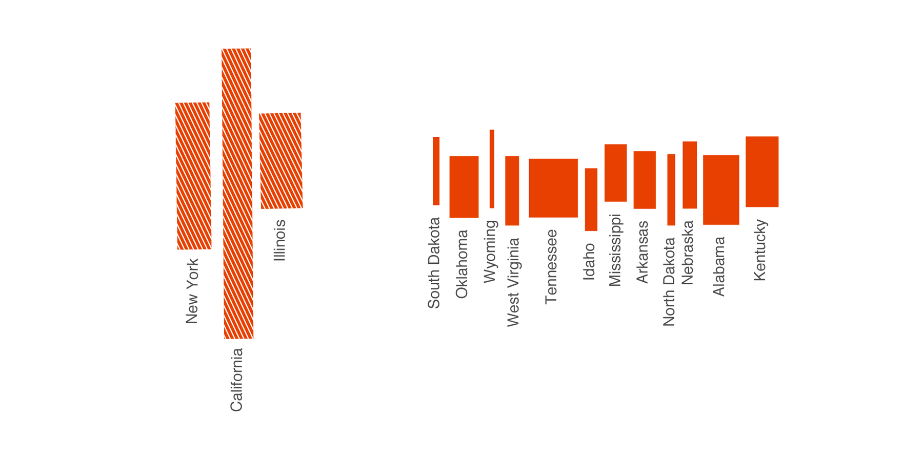
A story of search queries is a story of life. Using Google means telling a company what bothers you, what’s going on in your head, what you’re working on and what you need and want to know. It also tells a lot about where you are – without even giving away your GPS coordinates. Here are small multiples which show how often I searched for certain city names on Google. Please note that in this and the next examples, these words are just part of the full queries:
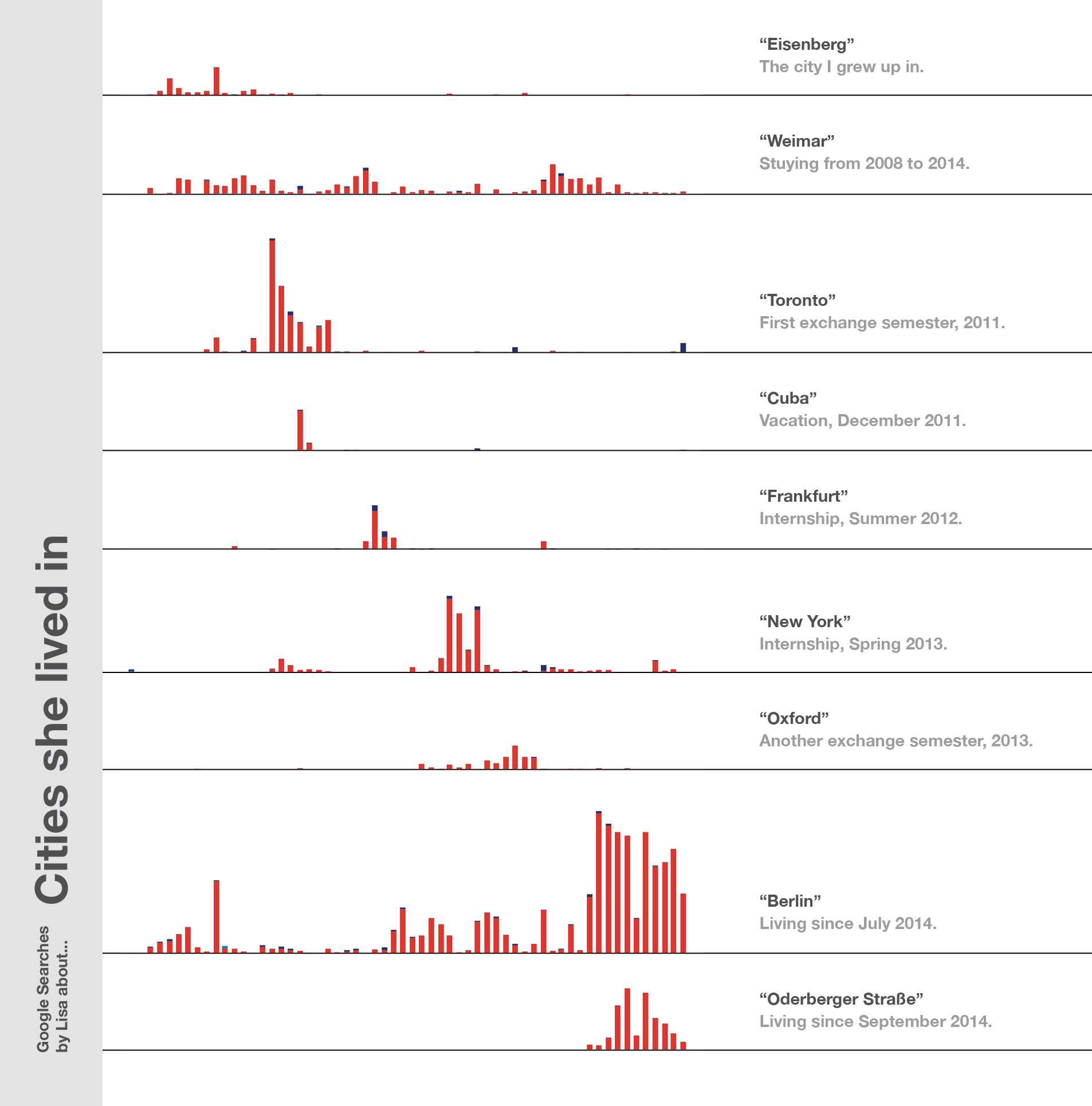
Some notes to make: First of all, Weimar is a small place – and when you live in a small city, you tend to not google so much for its name. You do search for “Weimar cinema” to check the running movies, but you don’t need directions to this one cinema. So the count of search queries for this town is quite small. The opposite is true in bigger cities: That’s the reason why Berlin and especially the street I live in comes with such a huge number of queries. Everytime I go to an event, I look for directions, from or to my address.
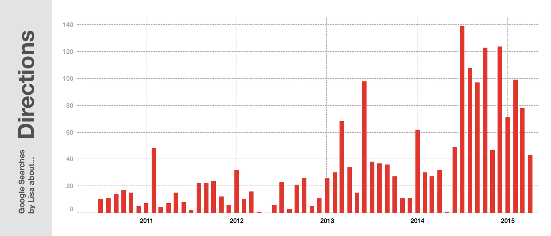
“But you lived in New York, Toronto and Oxford – why didn’t you google for directions as often as in Berlin?” Simple reason: I didn’t have data. I lived in Toronto in 2011 – I didn’t even have a smartphone back then. And I had a smartphone in New York, but this city has excellent apps and a great transportation system. And Oxford, again, is a fairly small place: I knew my way around the city pretty quickly. In general, the better my phone & internet connection is and the bigger the city I’m living in, the more Google knows about my location.
Projects
When I was 17 years old, I had a dilemma: I was interested in too many topics, but often only for a short period of time. I would get excited about the psychology of conspiracy theorists for three months, before drawing maps every single afternoon for the next six weeks – followed by dealing with the question of how to transfer the web into print for the next six months. I had a hard time to choose what I want to study. So I decided at some point: Instead of studying some content like psychology, business, philosophy, I would study how to communicate these topics. I would study the form (aka design). The following graphic shows my semester breaks especially well between the end of 2011 and 2013:
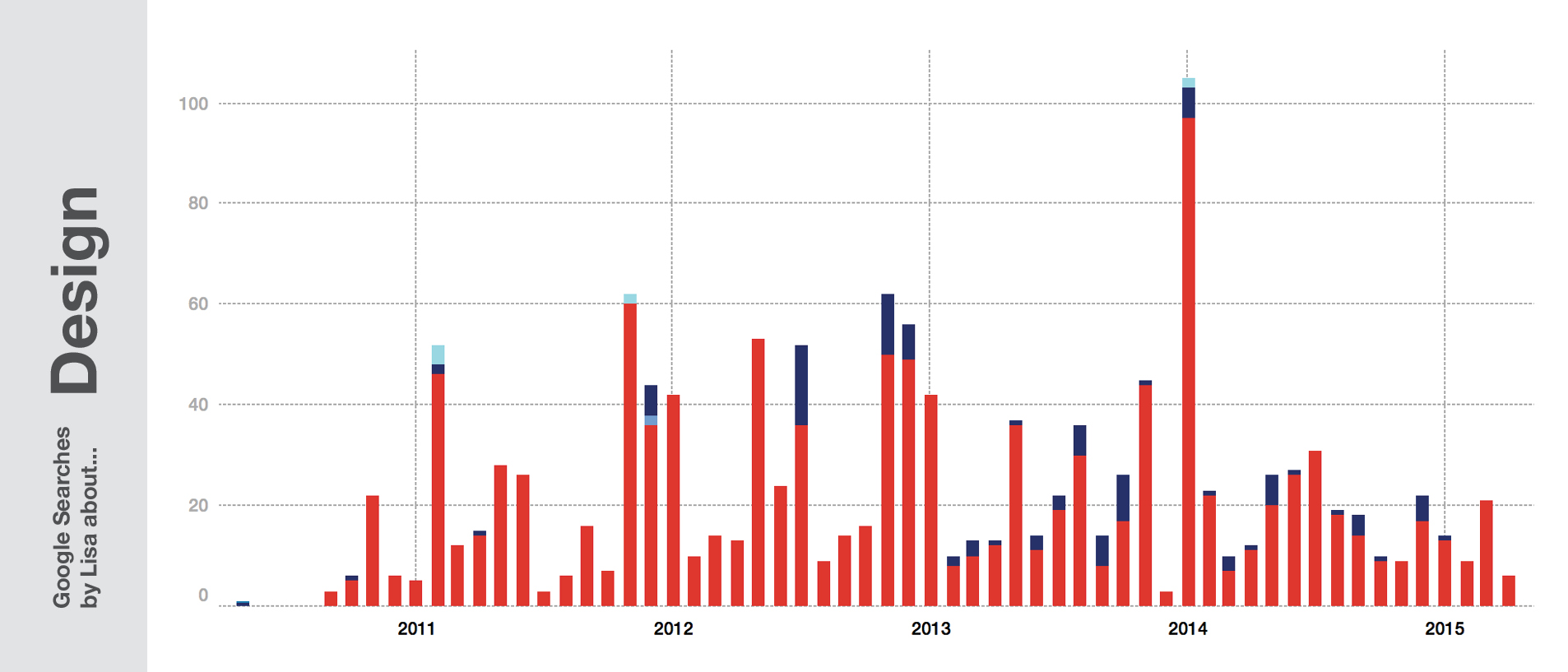
So like my 17-year-old me, I’ve been still allowed to dig into topics deeply for a very short time. When I was 21 years old, I learned a lot about the business of a publisher house. One year later I learned quite a lot about self-branding on Twitter (which doesn’t make my Twitter account a better one, btw). As one can see, I’m still searching for “Twitter” these days; mostly because I’m looking for a Twitter handle of a specific person.
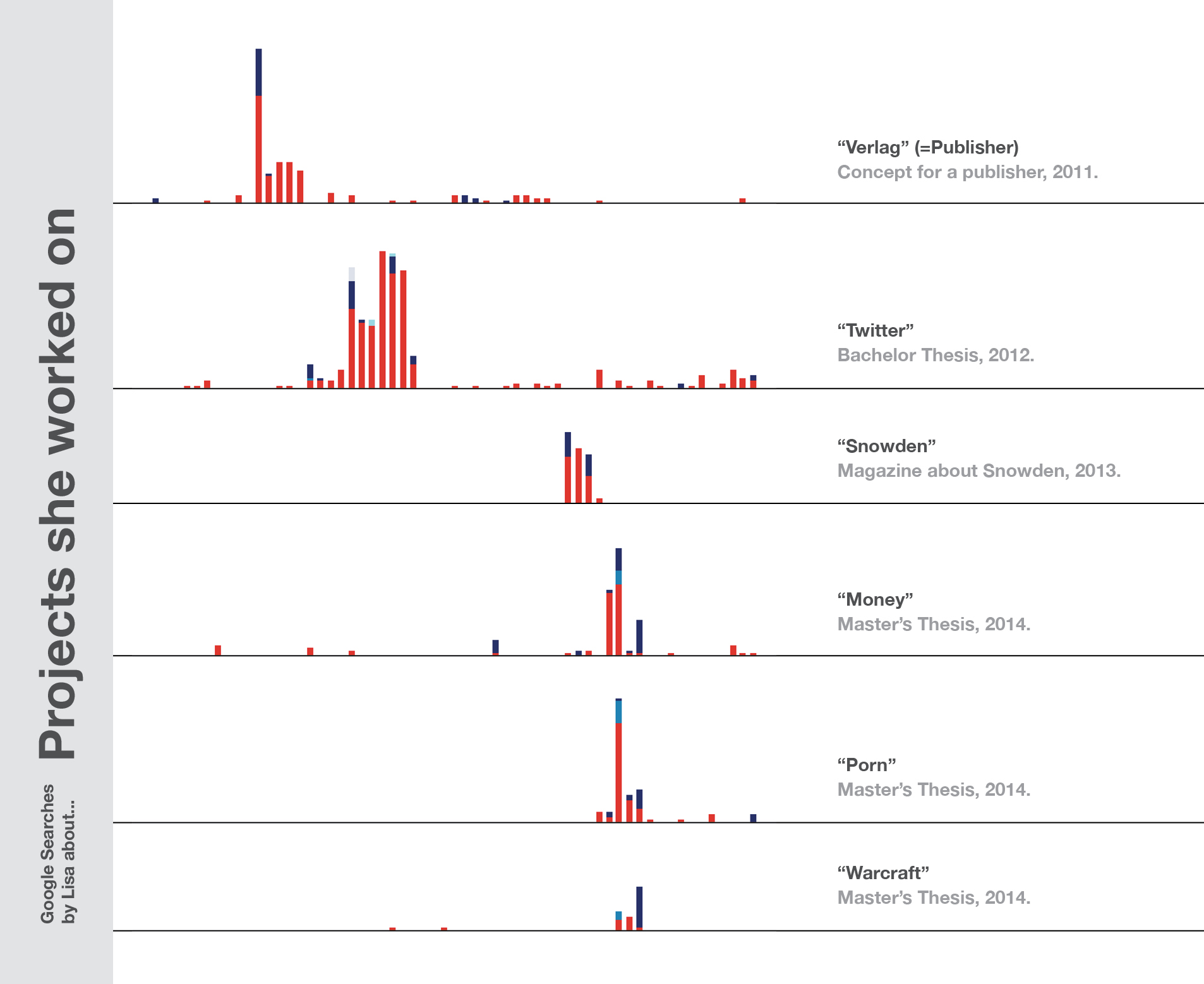
And, of course, my Master’s Thesis about “Making Money Online” came with Google searches about Spam, Scams, World of Warcraft, Porn actors, Bitcoin etc.
But the form I’m choosing for a topic differs, too. For my Master’s Thesis, the form for these topics was a magazine. For the last year, my topics got wrapped into data visualization:
Tools
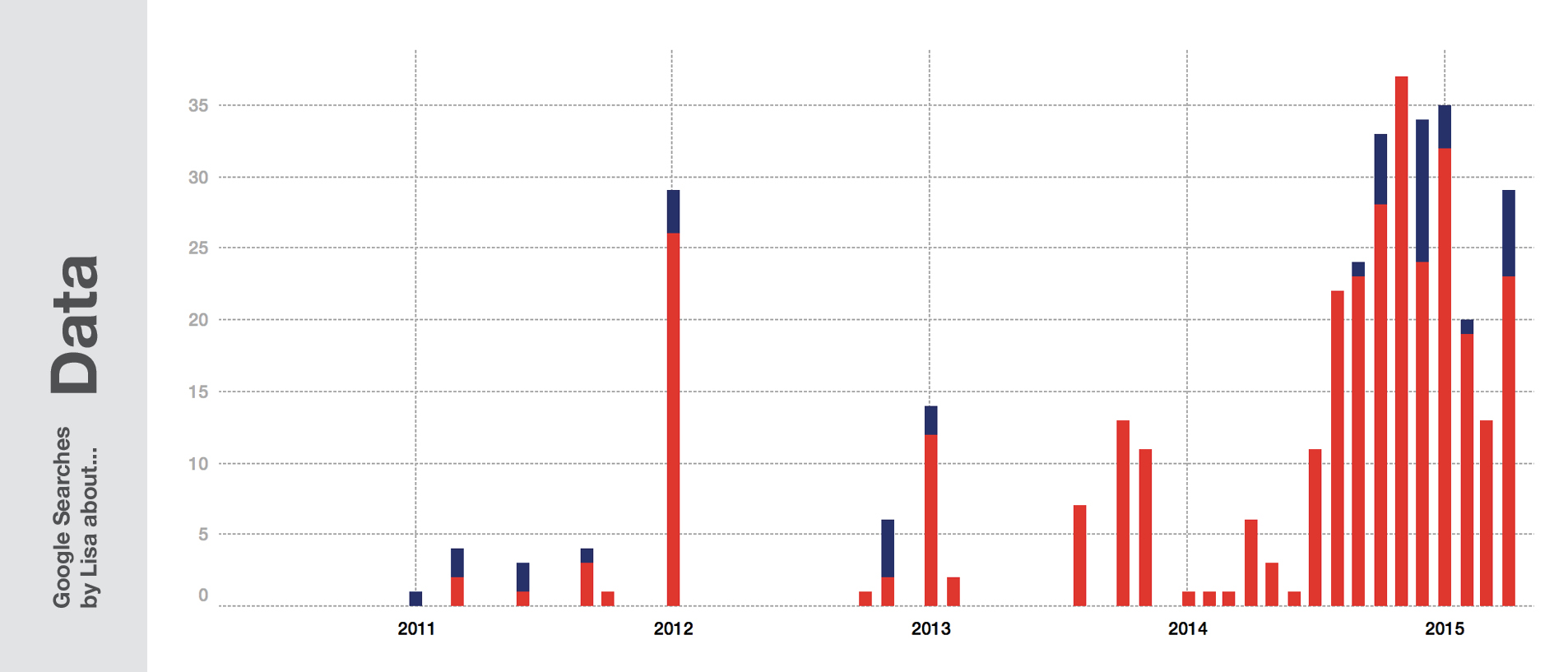
Data visualization or Magazine Design is a nice “form” to use, but you need tools to actually go from “content” to “it looks awesome”. Every time we have a problem or question with our software and we search for a solution, we let Google know which tools we’re using.
The tool that counts for most of my Google queries has been InDesign – not because it is the hardest tool (it’s fairly simple), but because I used it most often. In 2011, I learned about “change document grid InDesign”, “indesign index” and “master page indesign”. Three years later I wanted to know how to “indesign count selected objects”.
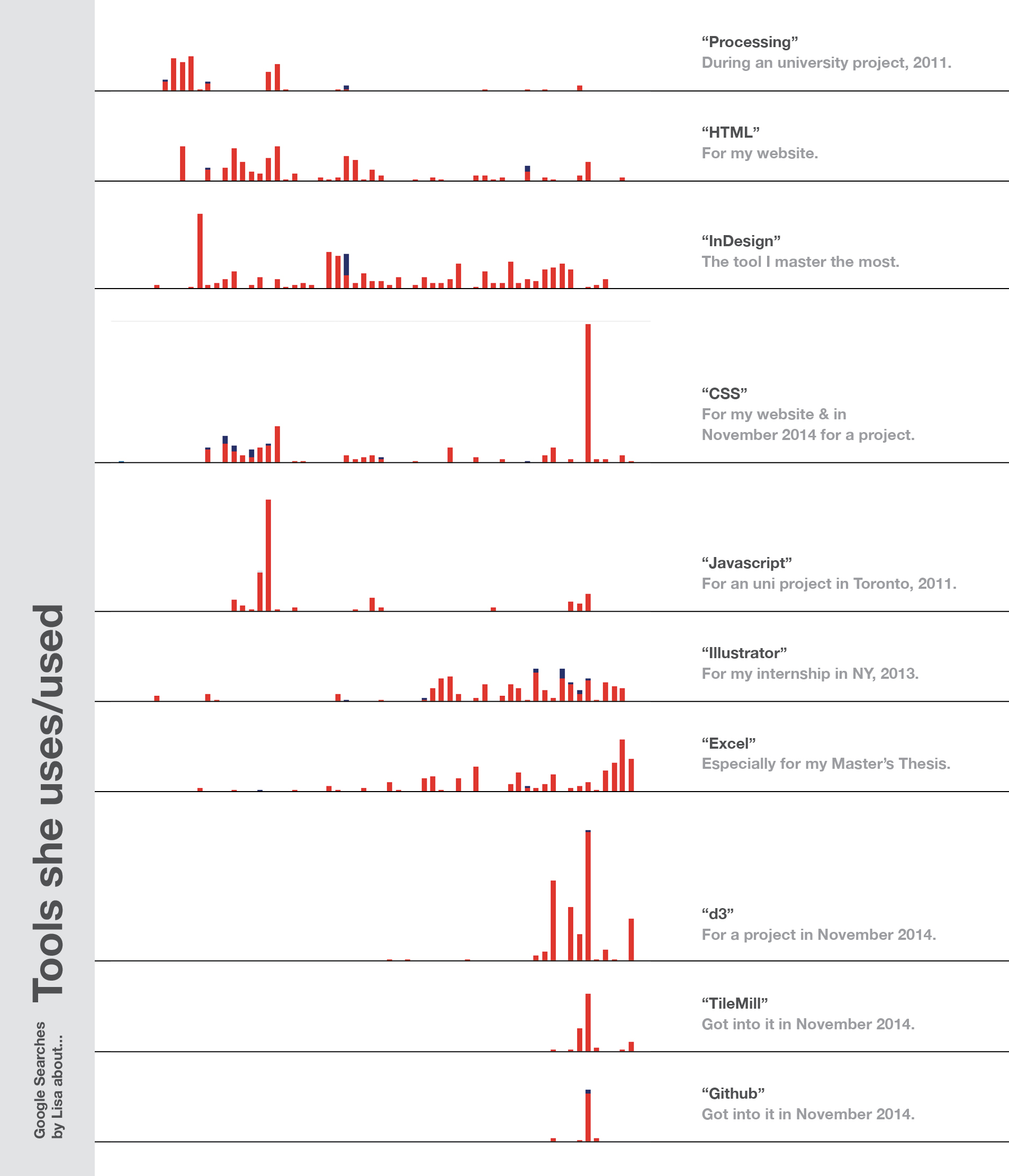
Illustrator and Excel show a surprising correlation – which makes sense when I think about my personal reason to learn Illustrator. I started using it for visualising numbers; numbers I got out of Excel. Everything else I wanted to create was possible in InDesign, too.
The spike in CSS, d3, TileMill and Github came in one week in November 2014. I was sitting in Lisbon and prepared for my work at ZEIT Online with many tutorials and a d3 graphic about unemployment rates in Germany.
The benefit of knowing what’s behind the data
To show the danger of reading data like my Google queries without knowing the reason for this data, I want to show an example:
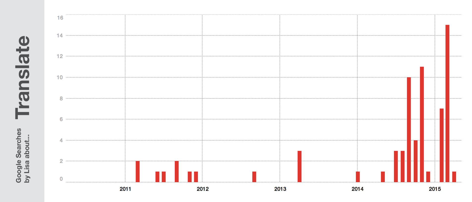
“Seems like in 2014 Lisa started to learn a new language”, right? No, I didn’t. I’ve always used dict.cc as my translation tool, but in 2014, Google’s “translate” option got better and better, and nowadays I’m using it as an alternative sometimes. But thanks to my somewhat better English skills, my usage of dict.cc actually decreased. So instead of saying that I’m more interested in checking vocabulary, I’m actually less so – but Google doesn’t know because I’m going straight to my favourite tools.
In this blog post, I provided a lot of explanations. I had the benefit of knowing the answer to the question “Why?” – an answer we usually don’t have when dealing with data. Usually, we don’t generate the data. So when visualising data, we normally only show what happened, and sometimes we show how it happened. As mentioned in the fallen.io video (16:18): “Now this isn’t to infer WHY this trend is occurring. That’s a discussion for another day.” Well, that’s exactly why data people have such a problem with it: It’s a discussion. It’s not a fact showing.
Showing the numbers is easy. Explaining them is the challenge.

Comments