tl;dr: In Data Vis, we should see aesthetics as a tool to increase understanding. In Data Art, we can see aesthetics as the purpose.
My last blog post let to a great, great debate on Twitter with great, great people. Thanks to everybody who attended and made me learn something new! E.g. that in 2009, Manuel Lima wrote a Manifesto in which he touched the divide between Information Art and Information Design, and which let to almost exactly the same debate that I had on Twitter. The points made reached from: A divide is necessary, to help both fields to A divide doesn’t benefit anybody and It’s not possible to make the divide.
I stumbled across one argument in this debate which I’ve met a few times so far: A data vis needs to be beautiful to be insightful. For example, Kim Rees noted in her comment on the Manifesto:
Visualizations should be coherent, convey information, and be good looking. We can compare this to architecture. An architect may focus solely on the structure and not the aesthetic and fail. Or she may focus solely on the aesthetic not the structure and fail. It’s the great (and few) architects who excel at both who create the truly wonderful buildings. […] I believe aesthetics are crucial to a coherent visualization.
I think she’s right, but it actually works in favor of thinking that “A divide is necessary, to help both fields”, as I do. I want to extend on her point and result in a claim for more Data Art. For that, I’ll use the same “goals” of Data Vis that Kim Rees mentioned: a) conveying information, being insightful and increasing “understanding” of a dataset, being meaningful. And b) Aesthetics, beauty, being visual pleasing, being good looking. For me, the first point – understanding – is the ultimate goal of a Data Vis. This can mean proving a point, providing an overview of a topic or optimizing an exploratory Data Vis for insight discovery.
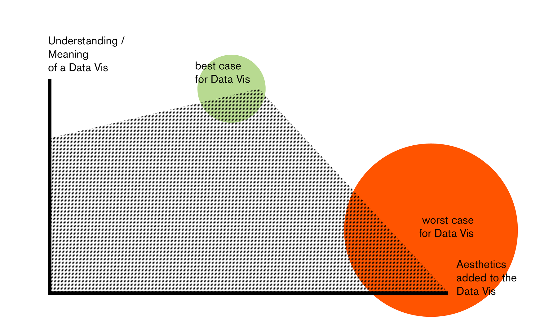
How to increase the understanding of a Data Vis? Besides choosing the right data points, aesthetics can certainly serve the understanding of a visualization – to structure the content in a better way, make it better readable or get the reader’s attention in the first place. But more added aesthetics only means better understanding to a certain degree. Meaning, an insightful chart which is ugly as hell is worse than an insightful chart which is well readable because of added aesthetics. But an insightful chart with too much focus on aesthetics and visual innovation (and therefore bad readability) is a worse chart than the ugly, insightful chart. For example, if a bar chart is the most graspable way to design a dataset, choosing a circular visualization will increase aesthetics, but will decrease understanding. In a formula:
Beauty that increases Meaning > Meaning without Beauty > Beauty that decreases Meaning
or, extremely broken down:
Meaning + Beauty > just Meaning > just Beauty
BUT that formula is only true when talking about Data Visualization and their purpose of being insightful. In Data ART, aesthetics CAN and sometimes SHOULD be the first priority. “Too much aesthetics” or “just beauty” can be a good thing. Not being dependent on the understanding anymore will make the visual experience enormously better – and it will make circular visualizations look like a dull compromise.
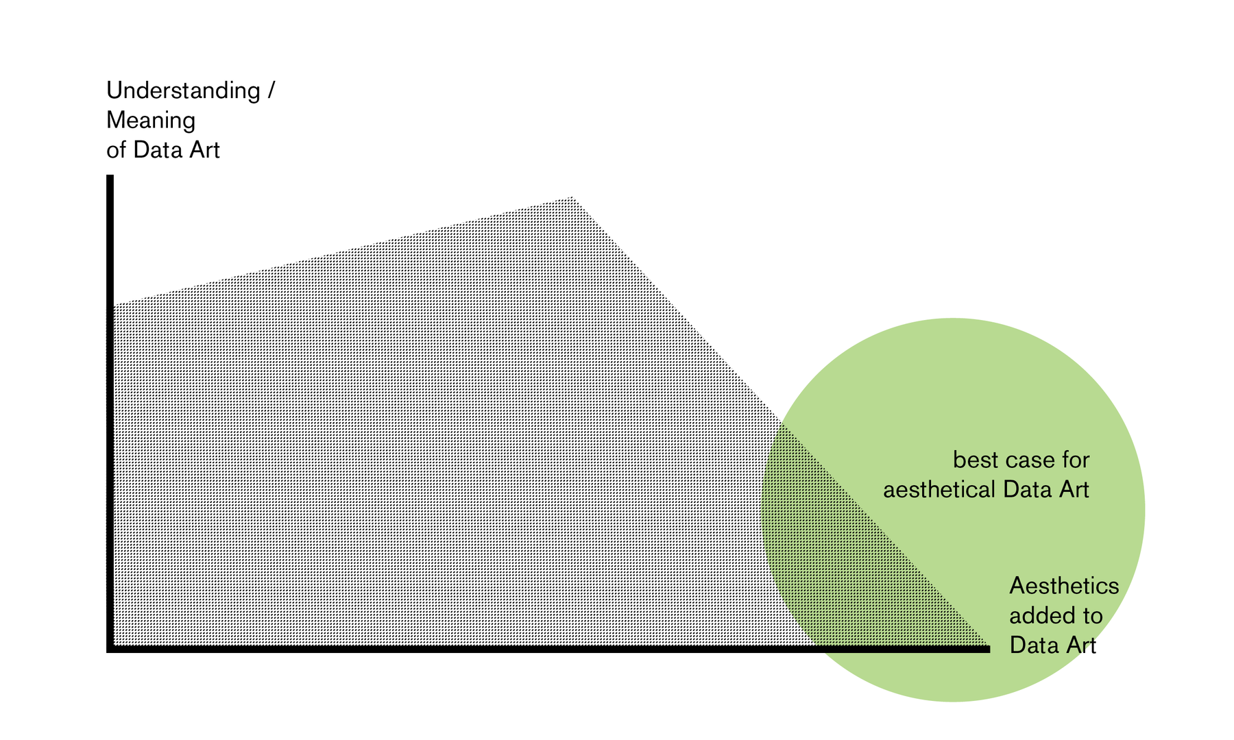
An example: I find some NYT and Periscopic charts visually pleasing – and I’m glad they are, because it helps to convey the data. But Jorinde Voigt? WOAH. Her images blows my mind! “The data itself is not important for the message, but serves to communicate a higher, sublime experience.”, I wrote about the work of Jorinde Voigt a few years ago in an university essay.
Yes, art is not only about aesthetics. Got it. But lots of people get attracted to the field by exactly that: The aesthetical side of Data Vis. They like that Data Vis combines “the serious stuff” (data) with “something pretty” (vis). Often, the visualization of data is an accessible way for them to get in touch with aesthetics. They buy coffee table books, get amazed by the looks and want to replicate it. But that results in an overhang of Data Vis which tries too hard to be beautiful to be meaningful.
I want these people to discover Data Art. To stand to their love of data aesthetics and to not sell their Data Art as Data Vis anymore. To get rid of compromises. To say openly: “Yes, this visualization piece doesn’t tell you anything about the data points. My aim was a different one.” Only then we can have an honest conversation about how to improve their work. To make that happen, it’s important to recognize Data Art as valuable. As Jer Thorp said in 2009: “I’d argue that work that might get classified as Information Art should be considered to be as serious and as important as that which gets labeled as Information Visualization.”
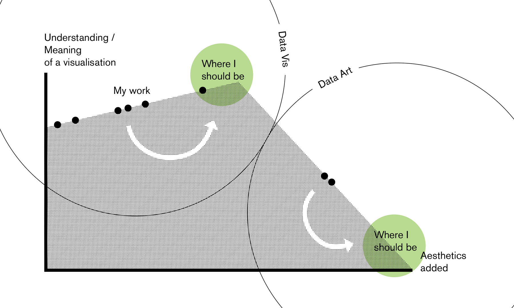
My source for the assumptions made are not only students of mine and people I talk to at the Data Vis Meetup Berlin, but also myself. My portfolio makes clear that I’m often on the “too much beauty for data vis”-side; I’m on the right side of the chart. I’ve traded meaning and readability for aesthetics many times. In the last few months and with blog posts like this, I’ve tried to move more to the left side of the chart. But because of my love of aesthetics, I should also move into Data Art; to the bottom right of the chart. For me – and in my opinion for lots of other people, too – it’s better to separate the two purposes (insights and aesthetics) then to satisfy both.
Where do you stand?

Comments