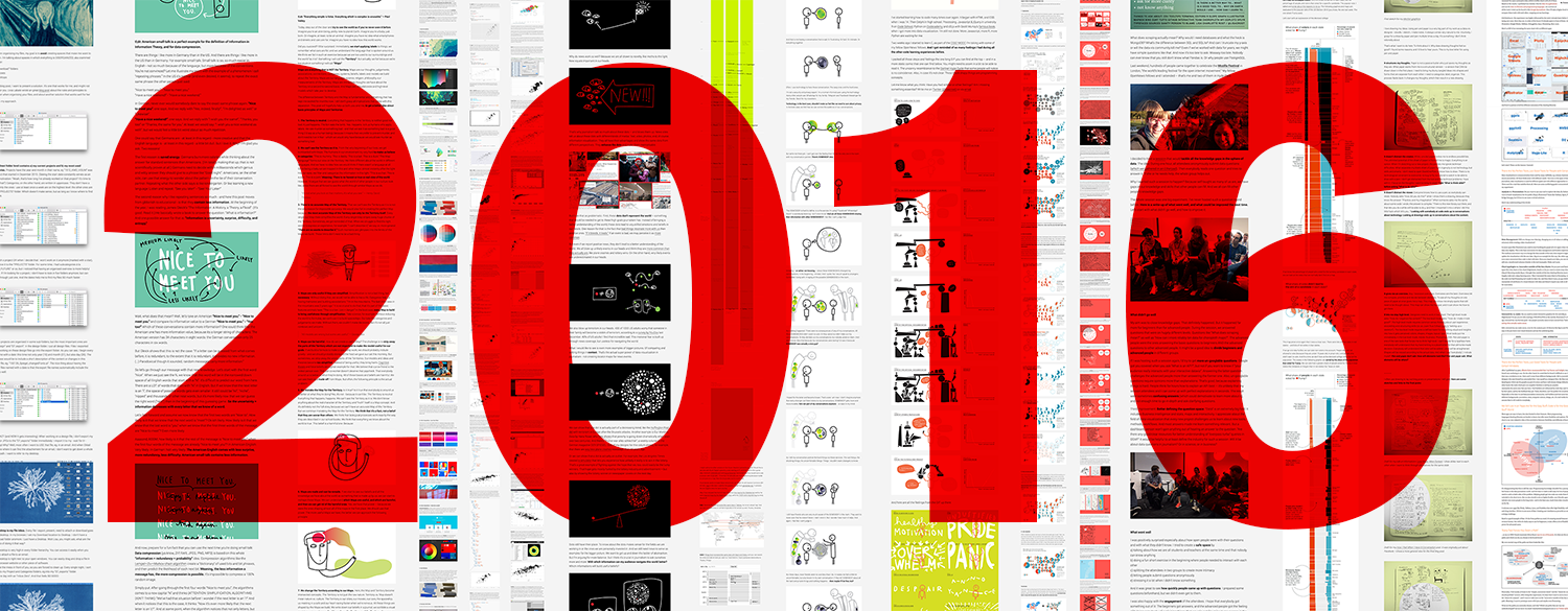
2016 was an intense year. In global news, Brussels, Brexit, Trump and Pokémon GO happened. In superduber-local news (meaning, in news regarding me), I spent nine months in Washington, DC as an OpenNews Fellow for NPR, went to more conferences than ever, gave more conference talks than ever, met amazing people and even talked with them, hiked up a 14k mountain, went to the Southern Hemisphere for the first time (I went in Summer! But there was Winter!) and thought about stuff.
Here I’ll present the questions I pondered in 2016, and my blog posts that resulted out of this pondering:
1 What is a good (data vis) tool?
2 What implications has the concept of Map vs Territory?
3 How does the US election work?
4 How to communicate feelings?
5 What is the purpose of journalism?
6 Do we all need to fight against world hunger with our skills?
7 What’s the point of visualizing self-tracked data?
Let’ start simple:
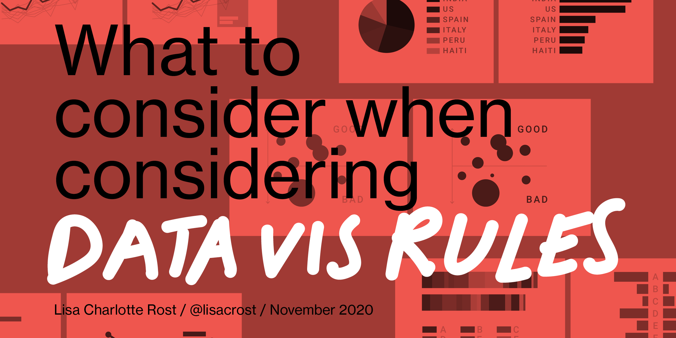
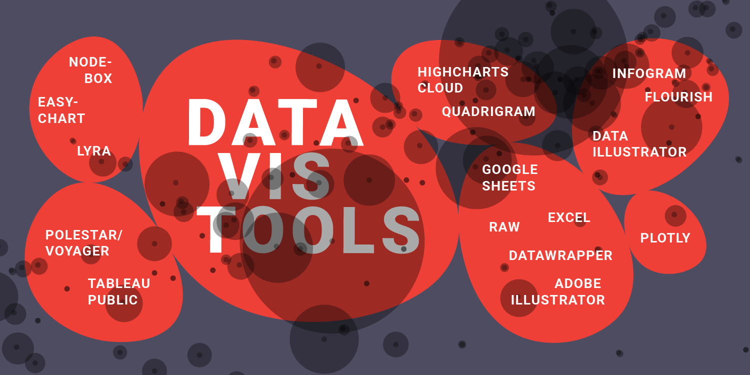
1 What is a good (data vis) tool?
I don’t have a Google Analytics Tracker installed on my blog; but I’m 68.3% sure that my very practical posts about data vis were the most visited.
After spending a few hours writing a post about tools for choosing colors in data vis (with a deceptive title that suggests that this post is a manual for choosing colors)…

…I aimed higher. I decided to recreate the same bubble chart with a few tools that were known and unknown to me. “Can’t be that hard”, I thought. “Won’t take that long”, I thought.
I ended up spending two full weeks recording GIFs, doing tutorials, checking Stack Overflow and GitHub Issues. The result were three posts. In the first post, I tried 12 charting libraries:

In the second post, I tried 12 data vis apps:

And the third post, I went high-level and compared the tools with each other (half a year later):
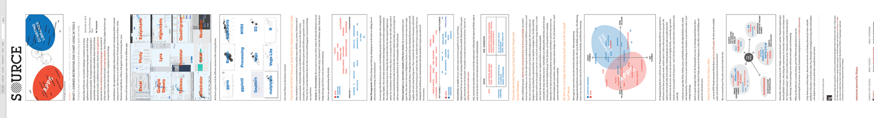
Do I use different tools now than I did before? No. Was that the goal? No. I’m happy to have a better overview of the field, and I was happy to share that overview with all of you. And the best thing about writing the post was having an excuse to have conversations with great tool makers like Christopher Groskopf or Ben Fry.
2 What implications has the concept of Map vs Territory?
The prize for my most-loved-concept 2016 goes to the idea of map and territory. It’s an old idea. But one I really learned to appreciate this year.
I got so excited about it that I wrote an explainer of the concept early this year:
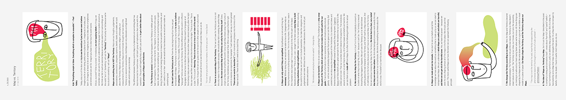
…and then came back to it in a talk at NACIS in October:

It’s an idea that made me think about the way I look at the world and how I interact it. And it definitely influenced my “Mission Statement” you’ll encounter if you’ll read on.
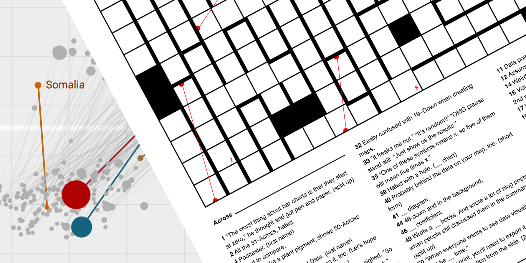
A very practical implication for the concept of “the map is not the territory” were this years’ election (map):
3 How does the US election work?
My brain started caring about the US election when everybody else was already tired of it. But then I couldn’t stop thinking about it. Once I understood the difference between the electoral votes and the popular votes, I was hooked. I wrote a general post about why I think that we should (also) map the popular votes:

After the election, I added a post with the actual election results in popular votes:
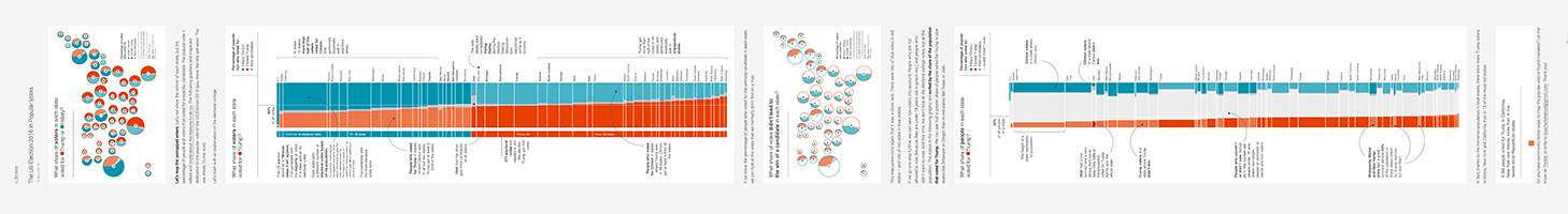
I didn’t get as much feedback as I hoped I would, but that’s ok. I guess everybody was just too busy making the most amazing election maps ever. I can live with that.
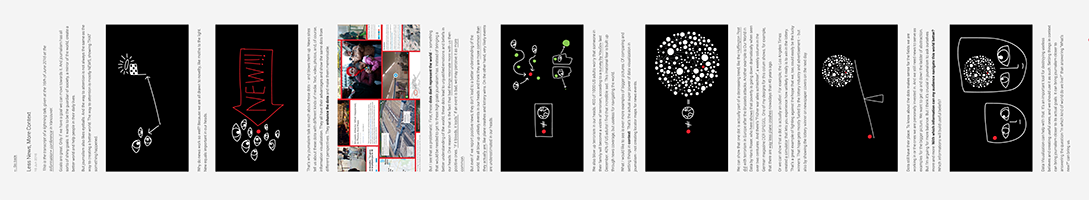
4 How to communicate feelings?
Feelings are hard, man. Also blurry. And necessary. This year I bravely marched into the unknown fields of writing absolute not-criticizable posts about my feels.
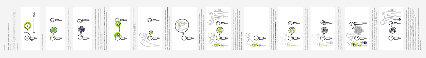
I started with explaining “How I feel when I have a conversation”– which was extra tricky, because it was about privacy issues and I don’t know a thing about privacy.
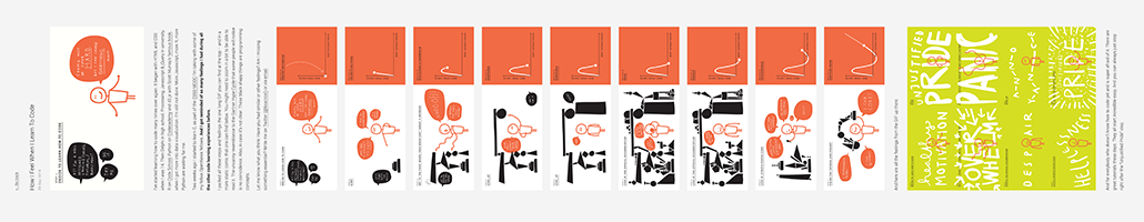
I continued with talking/gif-ing about “How I Feel When I Learn To Code”…
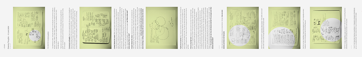
…and ended the year with a love letter to drawing thoughts and using pen and paper.
All these topics have been covered by smart people long before me. But I found writing these posts incredible helpful. In the best case, these posts built a compelling narrative for me – and let people compare their experiences with mine (as I’ll explain a bit later in the part “What’s the point of visualizing self-tracked data?”). Win-Win!
5 What is the purpose of journalism?
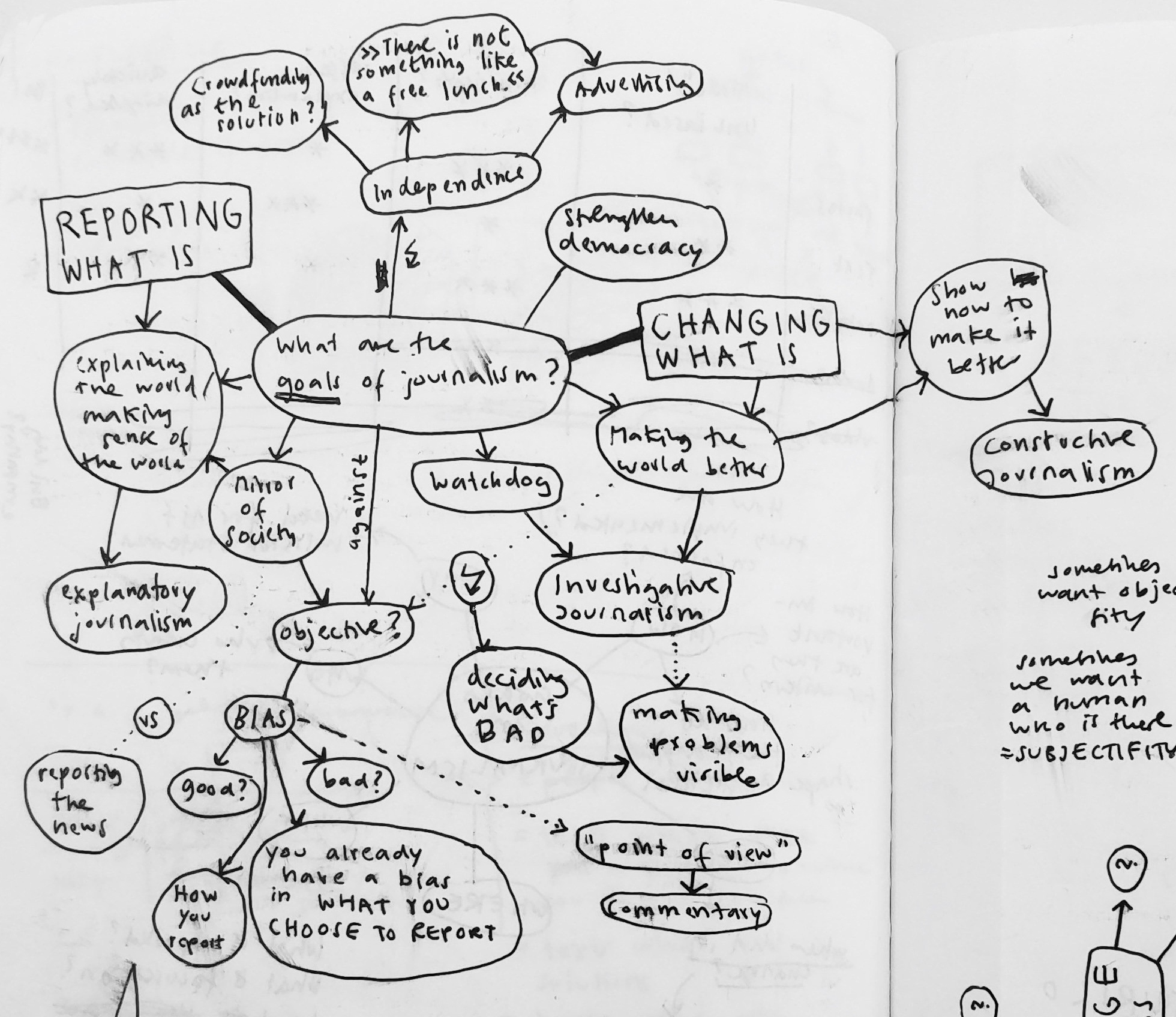
At the beginning of the year I went to the Responsible Data Forum in NYC. Coming from my “data vis for journalism” bubble, the mostly advocacy-driven attendees opened up a new field for me. One exchange with Steve Lambert during some team work resonated especially strong with me. When I asked him “So what’s the goal of our data vis here? What should it accomplish?”, he said “Change, of course.” I was blown away. And jealous: NGOs and activists have very clear goals; journalism lacks them. What IS the goal of journalism, really? To answer that question, I read lots of mission statements of newspapers, had discussions with smart people like Brian Boyer, Gregor Aisch and Alan Smith, asked Twitter and drew diagrams like the following:
I also gave a talk at my maybe favorite conference this year, Information+; about how I want journalism to focus on context instead of anecdotes:
But I found a truly satisfying answer to the question why journalism matters in a slightly related question:
6 Do we all need to fight against world hunger with our skills?
A highlight of this year was discovering Polygraph. Its creator, Matt Daniels is obviously very talented. But something felt wrong about it. In his articles, he drew attention to words that rappers use in their lyrics; instead of to the main issues on this planet (as Hans Rosling or Max Roser would do). I couldn’t understand why Matt didn’t use his amazing talents for the greater good. In an email conversation, he replied to my discomfort with the following words:
I’d argue that every project that I’ve done has had impact – it just depends on how you qualify “impact.” Take the rapper vocab project for example: Teachers have used it as a way to engage students in math/literature, grounded in something kids care about. Numerous people have emailed me that they were inspired to pursue coding, design, and data viz via that project. It’s been used to legitimize hip hop, which is widely marginalized in the realm of intellectual culture.
For me, that was mind blowing. He doesn’t just state that “impact” is a very, very blurry concept (lots of concepts are). He also implies that you can’t always foresee what the positive consequences of your work will be – but you can trust people to use your work for their goals. These goals might not be your top priorities (“engage students in math”), but they are THEIR first priority. It means that people can use and interpret you work in different ways. I can see something in a different way than the artist intended, and it can still be extremely valuable for me. And such an artwork could have a huge impact on me.
This epiphany made me more comfortable about my own (not-big-problems-like-hunger-solving) work. And I saw it as a good-enough purpose for journalism: Journalists try to educate people who are in different positions and will use the same information differently.
It also resulted in the first draft of a “Mission Statement” for my work. In my daily blog, I wrote down what kind of things I want to create:
- Something that resonates with me and makes me feel something, like music.
- Something that’s beautiful and sophisticated.
- Something that makes me wonder.
- Something that makes me feel astonished.
- Something that shows the map of the world I have.
- Something that sets my map in context to other maps out there.
- Something that sets my map in context to the territory out there.
- Something that shows me that maps are maps and not the territory.
- Something that shows me the world from a different perspective.
- Something that challenges what I know about the world.
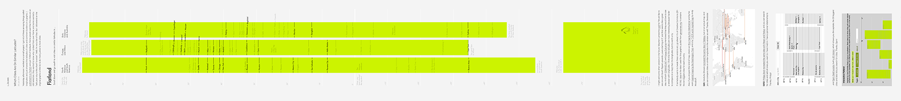
These goals don’t want to be fully achieved, but always aimed for. Doing this was my main intentions for my two election map posts, and for a little visual experiment that asked: Which Cities Are On Similar Latitudes?
Turns out, challenging beliefs is one of my favorites hobbies. I’ll try to come up with more ideas that will do so in the future.
7 What’s the point of visualizing self-tracked data?
People who have read my blog exactly a year ago might remember my issues with Self Tracking and its visualization. “Self-tracking results in irrelevant visualizations which give a fake comfort of meaning, but don’t help neither the tracked person nor the viewer”, I wrote a bit bitter. As somebody who has done some quantified selfing myself, I wanted to see a point in it, but just couldn’t.
Until I met Nicolas Felton at Resonate in Belgrade. Finally I found the perfect guy to ask. His most appealing argument in our conversation was that readers can compare their lives with the life of the self-tracker. That mirror-effect works similar to a fiction piece – but instead of asking yourself “Would I have been brave enough to destroy that spaceship from within?”, you ask “Do I have more or less social contact than this guy? Am I exploring my city less? Do I exercise more?”. I was so happy with that answer that I drew another little diagram:
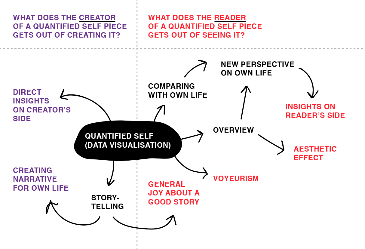
And it made me feel better about so many projects I encountered in 2016.
Last, and also least?
I don’t think that every post I wrote is the best post I’ve ever written, but I’m still glad I wrote them. Here are the posts that truly deserve to be mentioned at the very bottom of this Year In Review article:
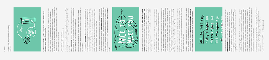
An explanation of Information Theory and its definition of “information”, applied to American vs. German small talk:
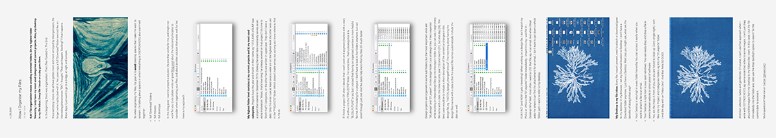
“How I organize my files”. A friend asked me to write about that. I’m looking forward to look back at it in 20 years:
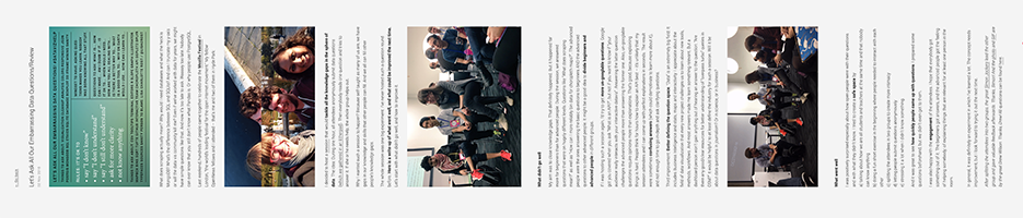
At the end of October, I gave an experimental session I titled “Let’s Ask All Our Embarrassing Data Questions”. A few days later, I wrote about what went well and what didn’t:
———
And that was it! 2016. Thanks to all the amazing people I met at all the conferences I’ve visited (Responsible Data Forum, Tapestry, NICAR, International Journalism Festival, Resonate, Data Journalism Unconference, Information+, Netzwerk Recherche, SRCCON, Hacks/Hackers Media Party Buenos Aires, NACIS, MozFest). Thanks to everyone who gave me an opportunity to give a talk or to talk through ideas. Thanks to everyone who retweeted my work and/or told me what they got out of it; it made my day every single time. Thanks to everyone who pushed me and/or the data vis field forward in 2016. And thanks to everyone who read an article or two on this blog.
Let’s do everything even better in 2017! If you want me to cover anything specific on this blog, write me an email (lisacharlotterost@gmail.com) or find me on Twitter (@lisacrost).
Comments