This is the transcript of a talk I gave at INCH in Munich at the 10th of March 2017. You can find all the slides in that insanely fast GIF up there and as PDFs on Github.
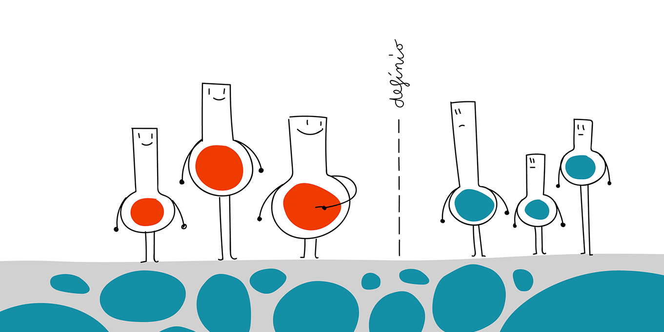
Finding a definition for data vis is ok-ish easy: Data vis represents data with visual elements to communicate information. Today I want to focus on a part of the data vis definition that is a bit overlooked: The part that tries to answer my favorite question of them all: “Why?”
So yes, why. Why the heck are we actually visualising data? I want to answer that question in five parts:
1 Data vis goals: the overview
2 Different industries have different goals.
3 Different data visualizer have different goals.
4 Goals influence each other.
5 What are your goals?
Data vis goals: the overview
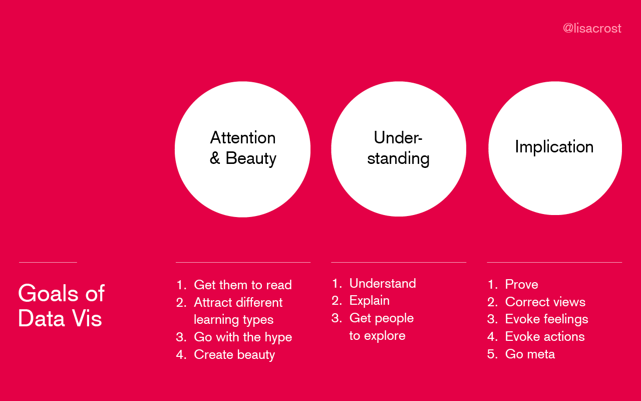
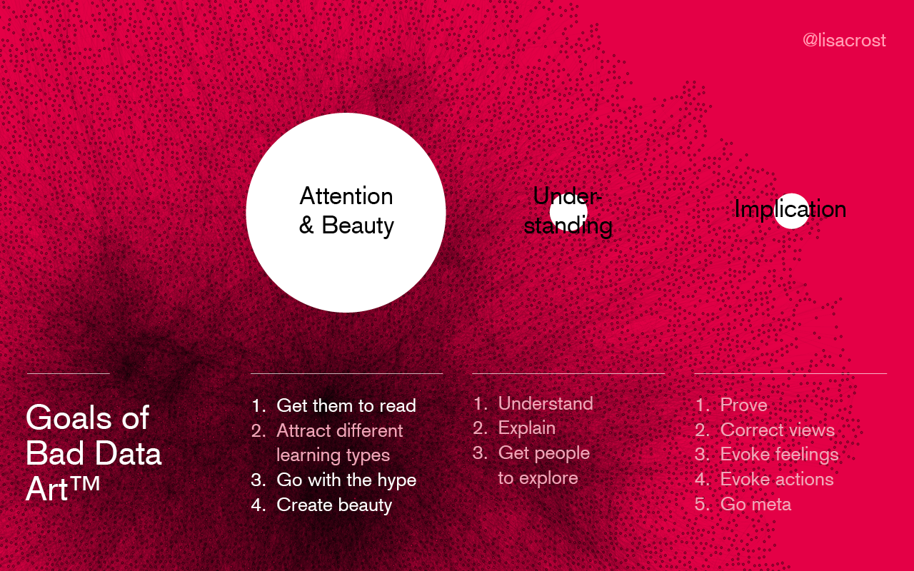
In this first part, I will present my mental model of possible data vis goals; sorted into three categories. Feel free to skim that part! The first category, Attention & Beauty, includes goals that relate to the quick first impression of a data vis project. After the first initial impression, we move to goals that relate to the decoding of data: Understanding. And the last category, Implication, contains the sense-making and long-term impressions of a data vis piece.
(These three categories are nothing new. Francesco Franchi said that data visualizations can “Inspire & Entertain, Inform, Encourage” and Andy Kirk stated that the user of a data vis needs to “perceive, interpret/decode, comprehend”. That’s both awfully close to my categories of “Attention & Beauty, Understanding, Implication”.)
———————
Attention & Beauty: 1. Get them to read: Data vis is still considered to be new and shiny and is often used to attract some eyeballs. Like the ads on Times Square, some designs out there try really, really hard to get your attention. An example is the typical colorful long-format infodesign blog post. But every magazine will tell you that infographics work wonderfully to get a reader’s interest after pages of long text. That’s related to the 2nd goal:
Attention & Beauty: 2. Attract different learning types: Different people absorb information differently. It’s like kids who choose different toys on a playground. Infographics are amazing for visual learners. An example is Vox’ interview with Hillary Clinton. Here, the reader can get one and the same bit of information via audio (in the video), via the transcript or via the graphics.
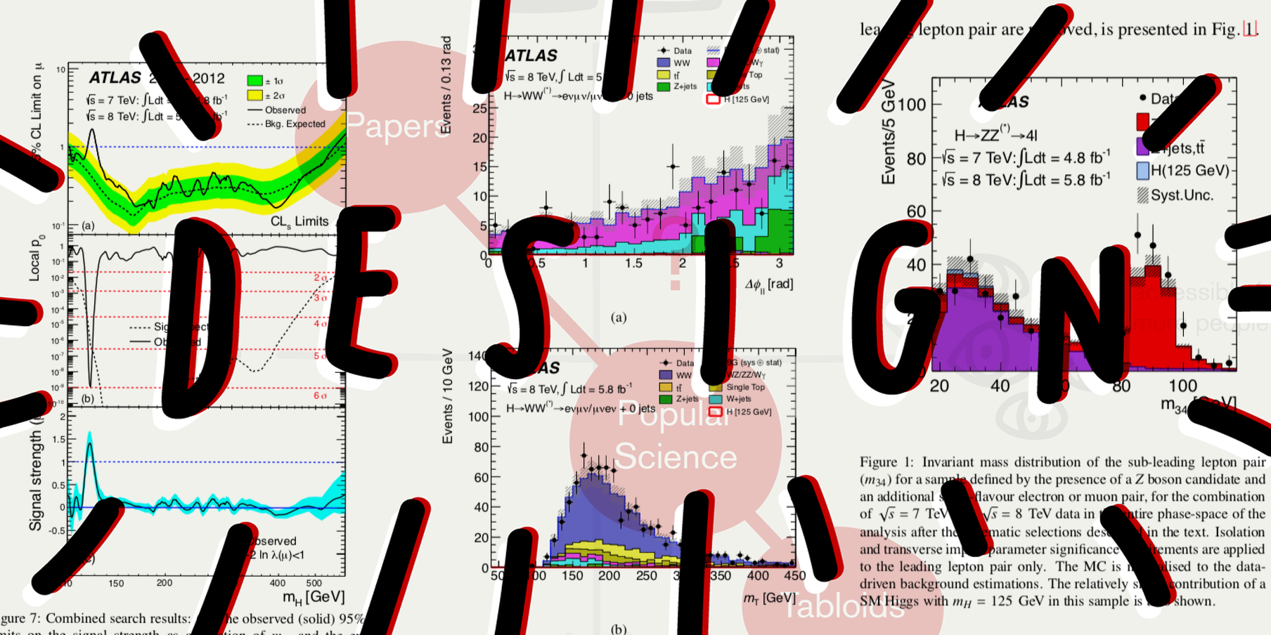
Attention & Beauty: 3. Go with the hype: Have I mentioned that data vis is still considered to be new and shiny? And people love shiny stuff. Even if there is no rational need for data vis, many people feel that they need it for their business/article/publication. Just because everybody else has it. Sometimes, that’s not a bad thing. “Going with the hype” also includes copying successful and fancy visualization formats. Remember NYT’s Snowfall from 2012? Every publication copied it; and made digital storytelling better in the process.
Attention & Beauty: 4. Create beauty: We can’t deny it. Data vis can look beautiful, at least according to a famous infodesign studio and a famous data vis subreddit. Good examples can be found in the tweets from @accidental__aRt: We have no idea what data is displayed, but it’s still interesting to look at. Not because of the content, but because of the form.
———————
Understanding: 1. Understand the data: Before we can communicate something to the outside, we need to understand it ourselves. When I sit in front of R Studio I feel like in a lab, forming hypotheses and testing them. visualizations help data scientists to make sense of the data, and they help quantified-self enthusiasts to make sense of themselves.
Understanding: 2. Explain: Once we’ve understood the data, we can teach it. A schoolroom is a good metaphor for that process, and data journalism is a good example. If you want to find good explainers, just look at every Washington Post graphic for the US election 2016. Man, they did some great work.
Understanding: 3. Explore: But sometimes, we can’t or don’t want to go as far as explaining the data. Sometimes we want our users and readers to explore the data for themselves. In this case, we build tools for them that make it as easy as possible to get the information they’re looking for; like libraries do (you know, the ones with books; not your Javascript ones). Dashboards are the by far most prominent examples in this category.
———————
Implication: 1. Prove: In some cases, making people understand something is not enough. You want to convince them of something (hopefully The Truth™) like a lawyer wants to convince the judge of the innocence of her client. Scientists are giving proofs with data and data vis all the time; and I’m always happy when I see journalists using the scientific toolbox. An example is the FT article that shows the correlations between Brexit votes and demographics.
Implication: 2. Correct world views: We are not rational. Although it would often be more useful to act based on The Truth™, we act as a consequence of blurry feelings and beliefs. To counteract them with data could change the wrong and harmful world views of (some)(open-minded) people. A great example is Max Roser’s Our World In Data.
Implication: 3. Evoke feelings: Data vis is probably not the preferred medium to evoke feelings (video, photo, illustration; heck, even text is better at that), but you might find yourself in the position where you’re looking to get an emotional response about your data from the user/reader. Data vis projects that achieve that are “U.S. Gun Deaths” by Periscopic or “Fallen” by Neil Halloran.
Implication: 4. Evoke actions: Once you got your reader to feel something, you often don’t want to stop there. You want them to do something: donate, participate, etc. To be honest, I can’t think of any data visualization that tries to convince me to do something specific. Let me know if you got an example!
Implication: 5. Go meta: Data defines our lives in many ways. Data vis can show that and can make us think about how data is collected, stored or analyst or used for decisions. Data art can achieve that in its extremes, but “normal” data vis can show a taste of that. Giorgia Lupi, co-founder of the studio Accurat has been an advocate for that for years. In 2015, she stated that Accurat’s visualizations want to “embrace complexity” and “maintain the nuances of the data”.
Different industries have different goals.
After going through all the goals, we will now have a closer look at the data vis goals of certain industries.
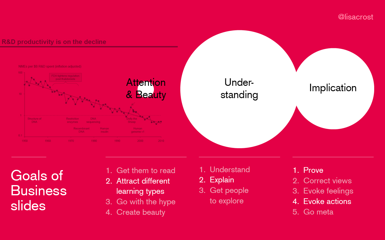
Let’s start with business slideshows: They have very little emphasis on goals of the first category, Attention & Beauty: Since the data is often crucial to the user, she will actively try to understand it and doesn’t need to get convinced to do so.
The opposite is true for Data Art: Good data art looks appealing. But it also has a huge focus on sense-making in a deeper way (“Implication”).
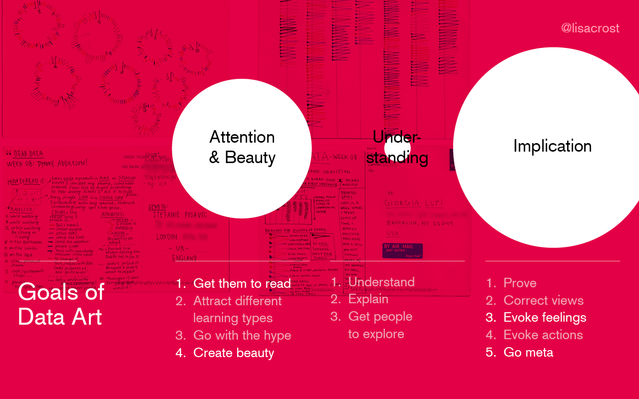
“Bad” Data art often offers the same (kind of) beauty, but without the implication. It serves as a decorative illustration in this role. It’s still worth existing, e.g. for cover designs of business reports.
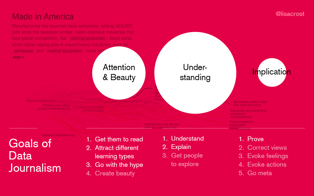
And then there is Data Journalism. Its biggest focus in on understanding. It needs to attract readers and as we’ve seen, wants to change people’s mind; but most often, that’s not its main priorities.
Different data visualizer have different goals.
We all get into Data vis because of slightly different and also because of slightly similar reasons. Personally, my main motivations to do data vis are to create something beautiful, to make myself and other people understand something, to offer an overview and to change people’s beliefs. That is very close to the goals of data vis for journalism, and I do feel very home in that field.
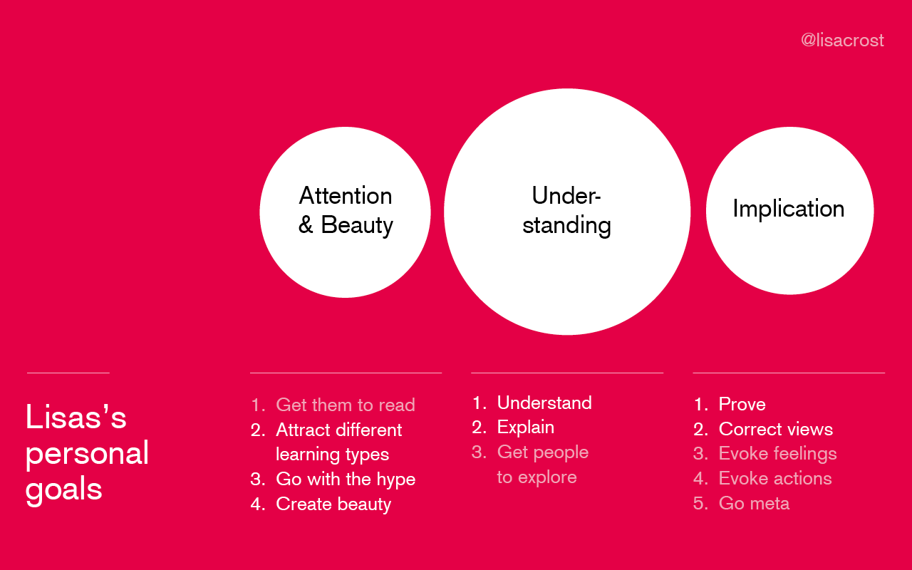
Why is it important that personal goals align with field goals? Because goals define priorities and how much time you spend with which task. If your job is to make data beautiful, but you don’t care about beauty at all, you’re in the wrong job.
Another way to think about goals and priorities is to ask: What do you sacrifice for what? If your main priority is beauty, you will sacrifice understanding for a fancy new visualization form. For me, understanding is more important than beauty. I’m somebody who says: “Ok, let’s show the boring bar chart instead of the multi-dimensional slope chart since nobody seems to understand the latter one.” But beauty AND understanding are definitely more worth than just understanding; and I’m willing to put a lot of time and effort into beauty.
Goals influence each other.
Goals/outcomes are interconnected. Some influence each other positively, some influence each other negatively. For example, if your goal is to make your data visualization beautiful, you’re more likely to have evoked emotions as an outcome than with a boring bar chart. Evoking emotion is a side-effect of beauty.
But HOW goals influence each other is up to discussion. Different data visualizers have different opinions about how the goals of the three categories are connected. As an example, I want to talk a bit more about the relationship between beauty and understanding.
Moritz Stefaner, the “truth and beauty operator”, sees a tight connection between truth (understanding) and beauty in Alberto Cairo’s book The Functional Art: “Truth and beauty have always been two sides of the same coin. […] For Buckminster Fuller, beauty was an indicator of truth.”
Francesco Franchi argues the opposite in his book: “While creating an infographic, one moves within a spectrum: on one hand, there is aesthetic, and on the other, the information.”
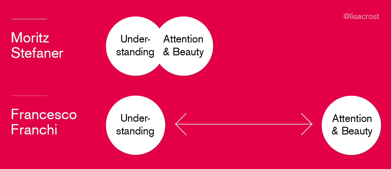
Who’s right? Are understanding and beauty two extremes that couldn’t be further away; or extremely closely related?
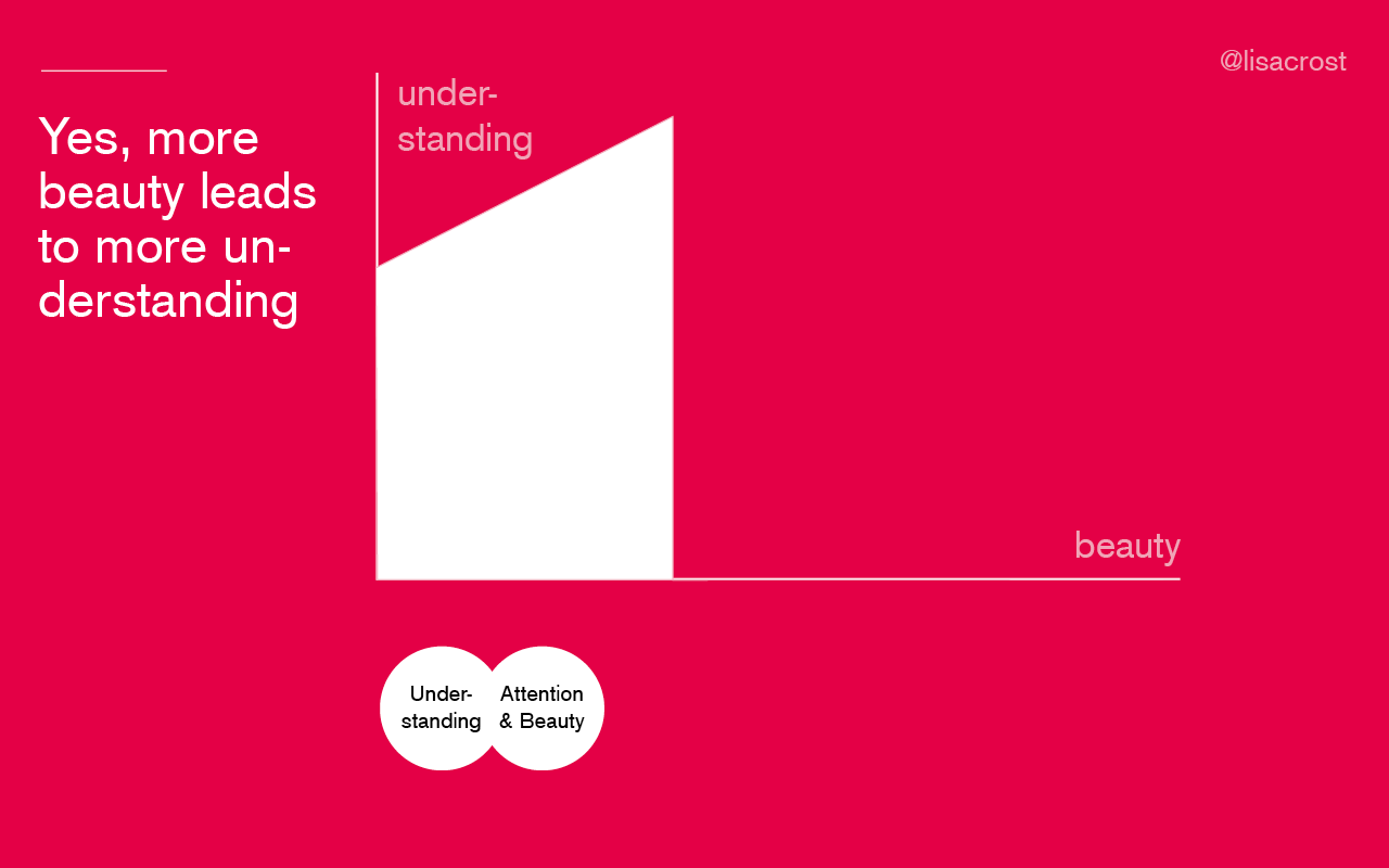
Both are right. Yes, bringing more attention to the style can lead to more understanding. Just remember Edward Tufte’s Data-Ink-Ratio.
But that’s only true to a certain point, in my experience. If the focus on beauty is too high, the effect inverts: Understanding goes down. That’s why data art (with a high focus on Beauty) often has a low focus on understanding; and that’s why data vis with understanding as its highest priority can only be beautiful to a certain degree.
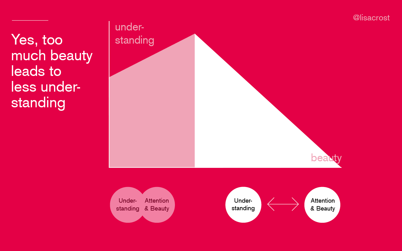
This example shows how goals can positively and negatively influence each other. But it also shows how opinions about goals can differ. I wonder what you all think about the relationship between beauty, understanding and implication. Let me know!
What are your goals?
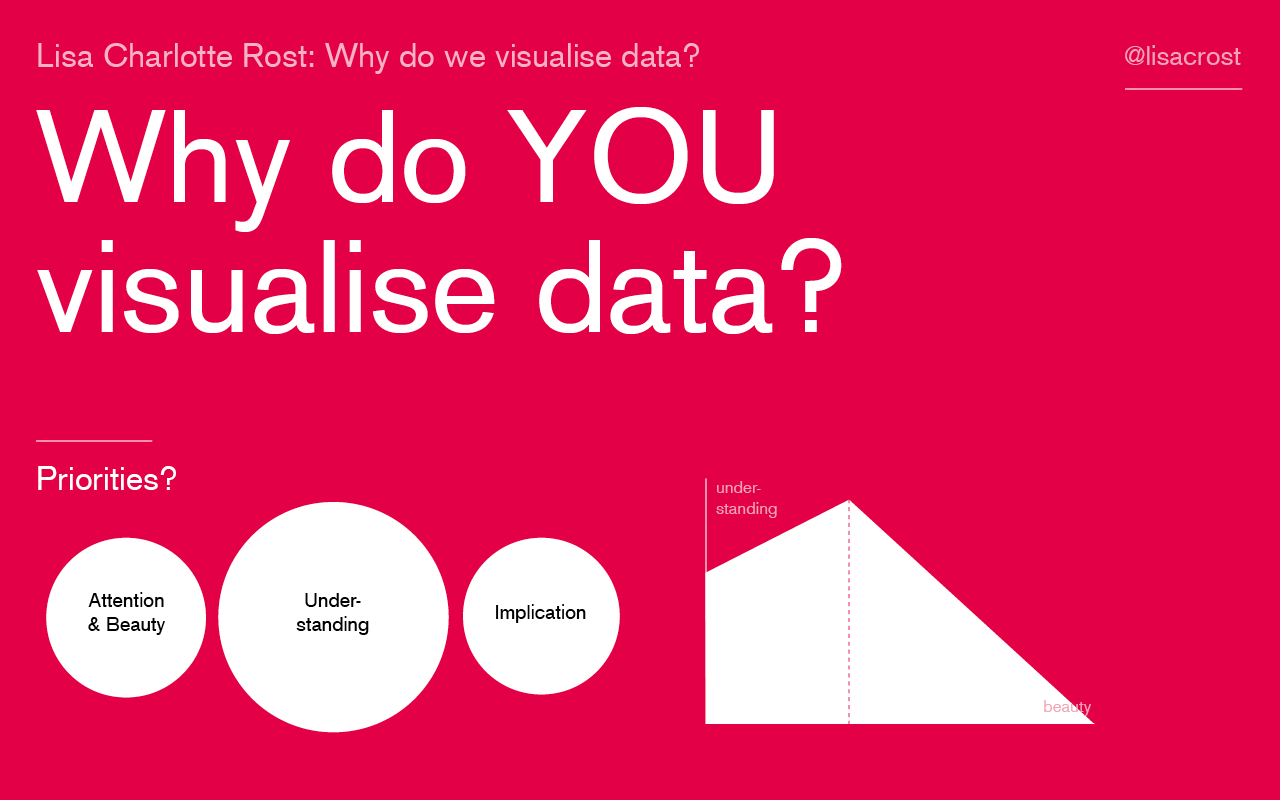
I want to make you think about your goals when you visualize data. What are your personal priorities? What are the priorities of your industry or company you work at? Where do you stand between beauty, understanding and implication? And where do you want to stay?
Please write me an email with your thoughts, goals, new categorizations and critique (lisacharlotterost@gmail.com) or look me up me on Twitter (@lisacrost).

Comments