Disclaimer: Since November 2017 I work for Datawrapper, a charting tool. Which means that I can’t review any charting tool unbiased anymore. I will still try.
2.5 years ago I wrote an article recreating the same bubble chart with 24 different charting tools: twelve charting apps and twelve libraries/frameworks. Afterward, I wrote an article for SOURCE explaining what I had learned during this experiment.
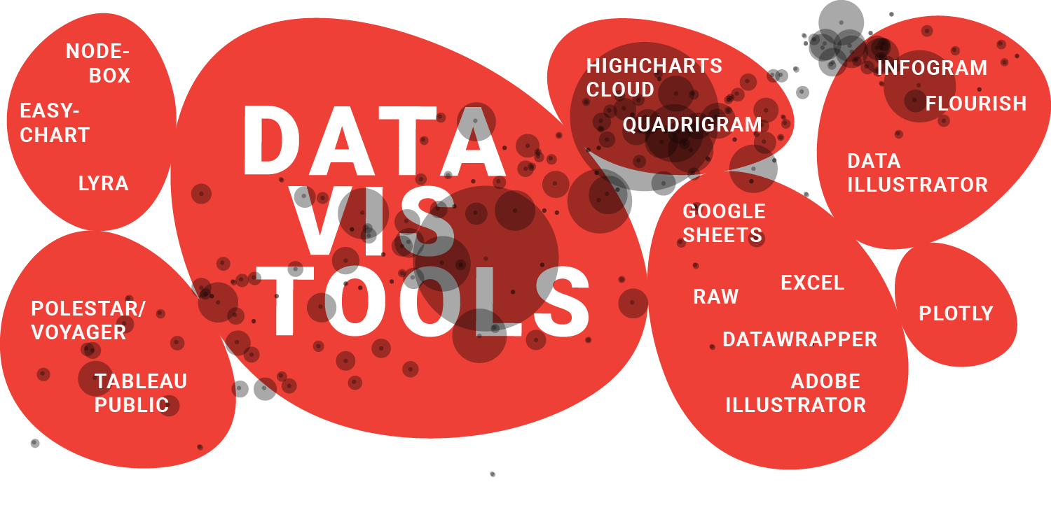
During the last 2.5 years, the tool landscape changed. It’s time to look at it again! I will review three fresh tools (Infogram, Flourish, Data Illustrator), will review three already reviewed tools freshly (Plotly, Google Sheets, Datawrapper) and update three other ones with better descriptions and/or GIFs (Tableau Public, RAW, Adobe Illustrator). Scroll to the end of this article if you’re curious about my decisions what I included and excluded.
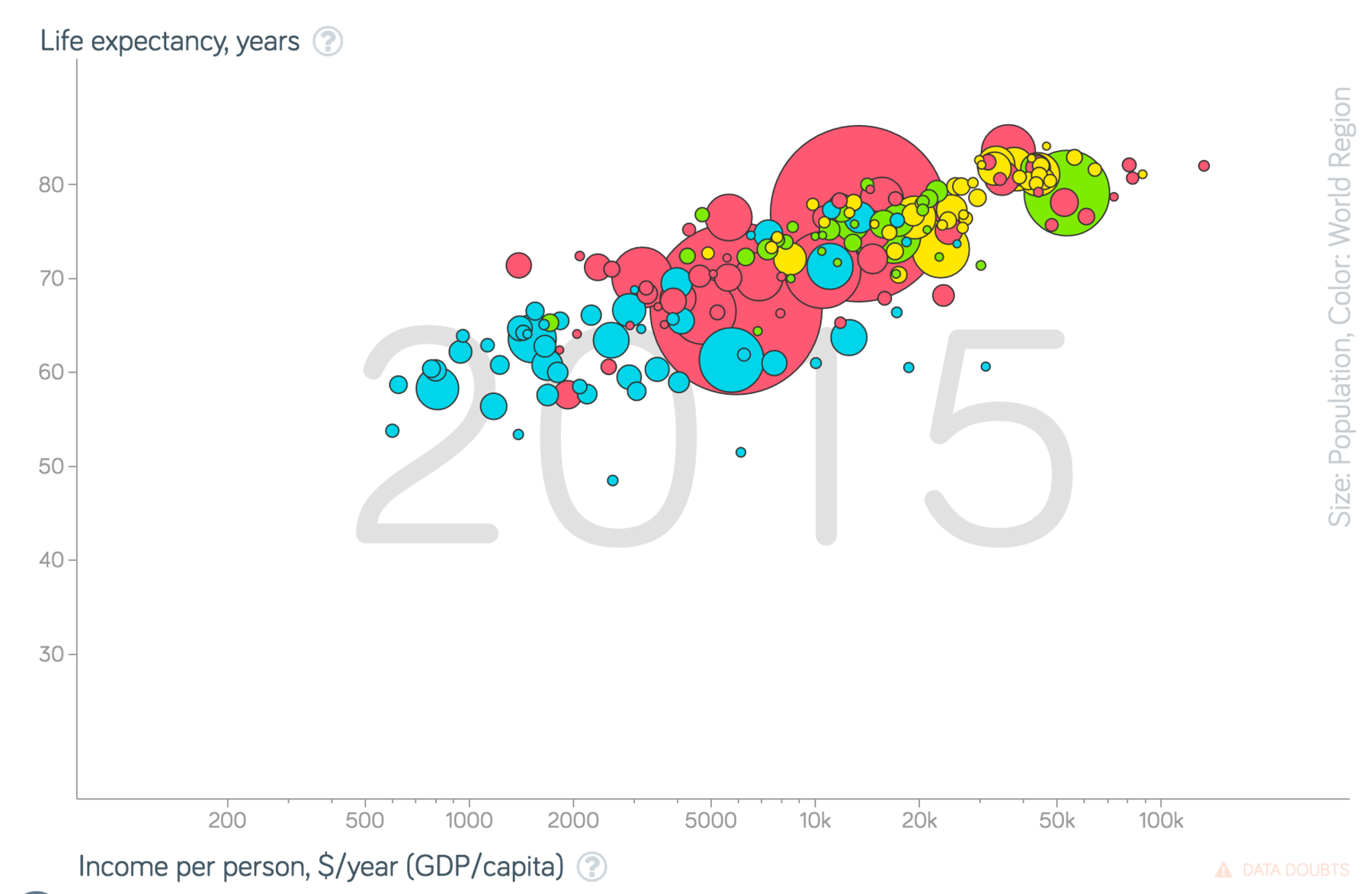
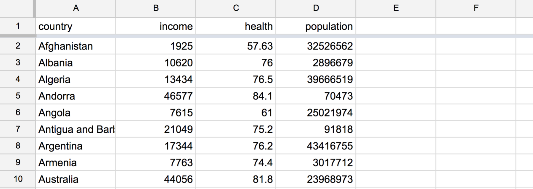
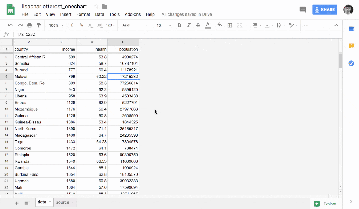
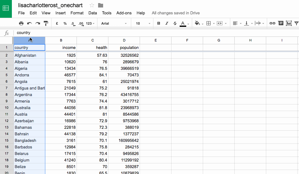
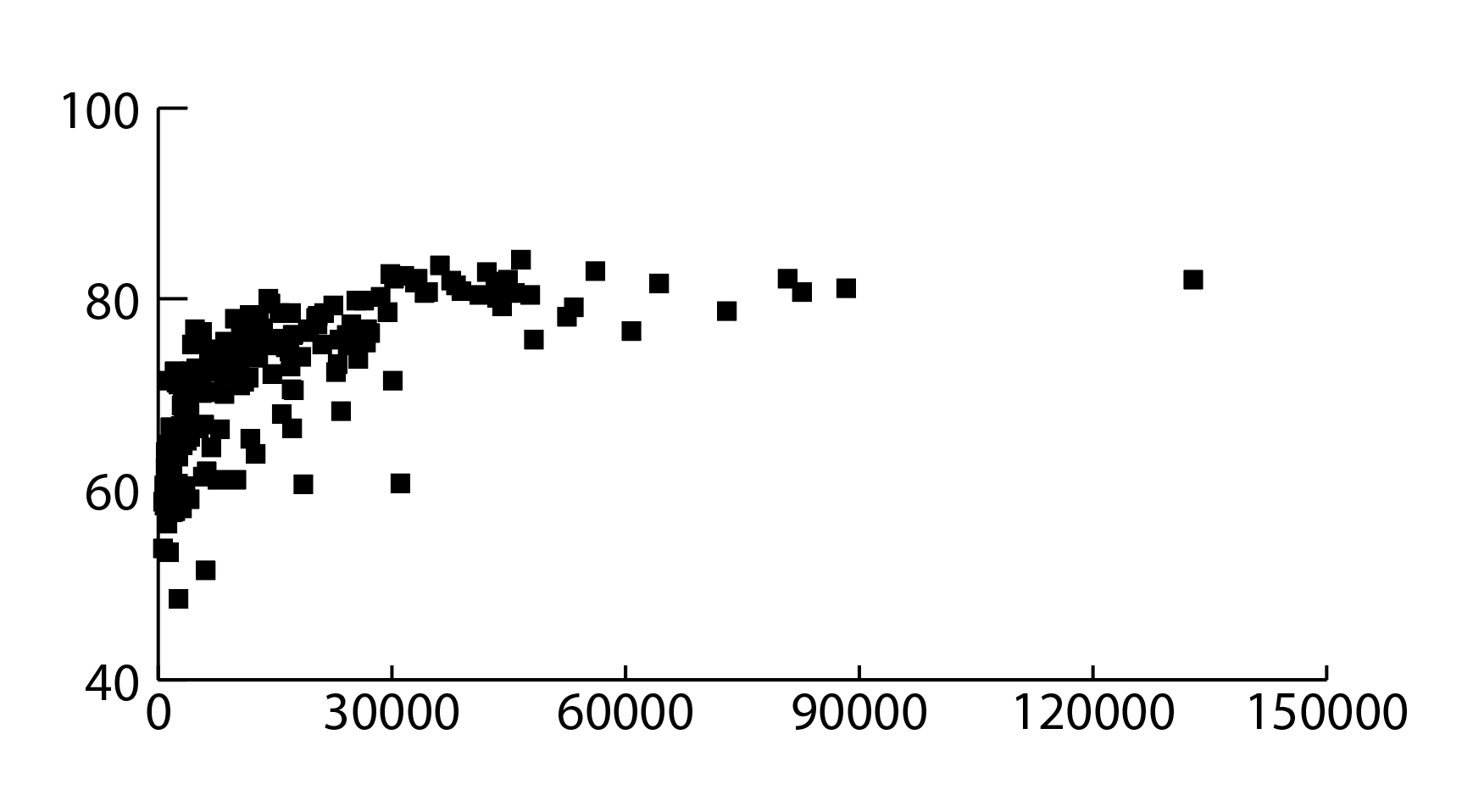
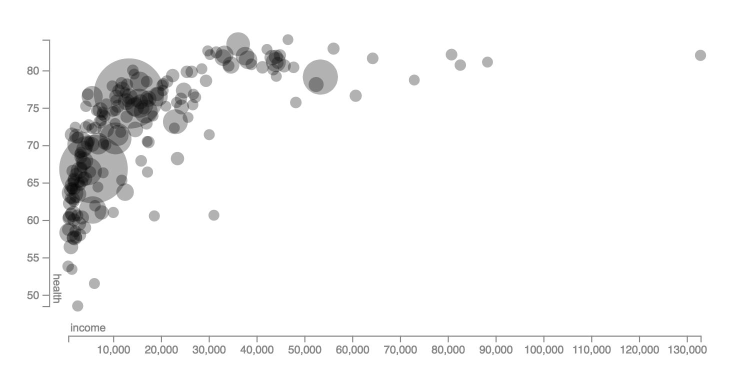
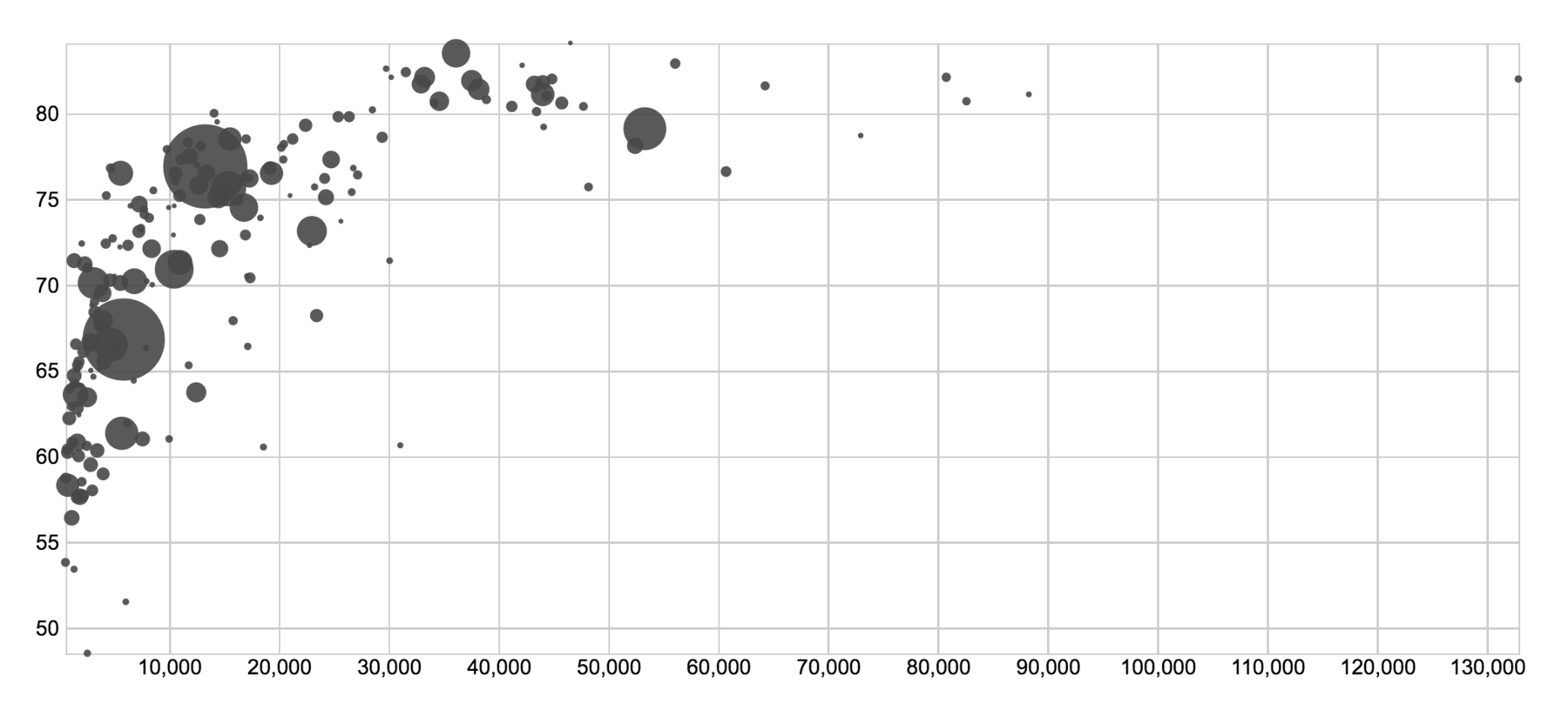
The chart I’ll rebuild is the same as last time. You can find the underlying data in this Google Spreadsheet.
There’s also something new: I’ll embed all embeddable charts, e.g. from Infogram, Flourish, Datawrapper, Plotly and Google Sheets. So try to hover over a chart or two. And yes, this is a heavy blog post. (I hope you’re reading this on wifi.) (Sorry.)
As last time, I will have opinions. Keep in mind that these are utterly subjective and only about the workflow that I had when creating this specific bubble chart with this specific data. My reviews won’t tell you about the experience of creating another chart type with the same tool. Or about the experience of creating the same chart with different data. Or which chart types you can create in these tools (head over to Andy Kirk’s Chartmaker Directory to find out). I hope it’s still useful to see these tools in action. Let’s start:
Embeddable Charts
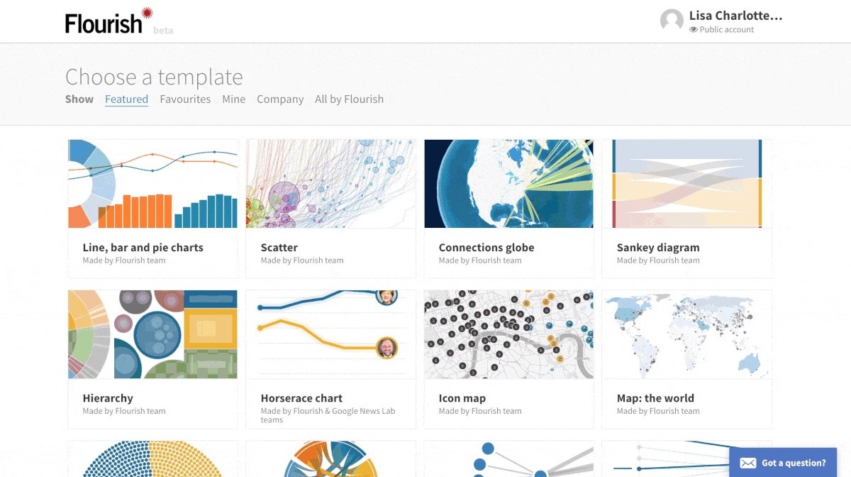
Infogram I’m not sure why I missed Infogram in the last blog post. Now owned by Prezi, it’s a colorful tool that outputs interactive charts. What I liked (and most tools don’t offer): Infogram showed me my chart and its underlying data on the same page. In general, this tool did exactly what I wanted, although I missed some options: setting the opacity and a log scale, and adding labels to my bubbles. And I couldn’t assign data columns to axes: If my columns were in a different order, I would have needed to reorder them first.
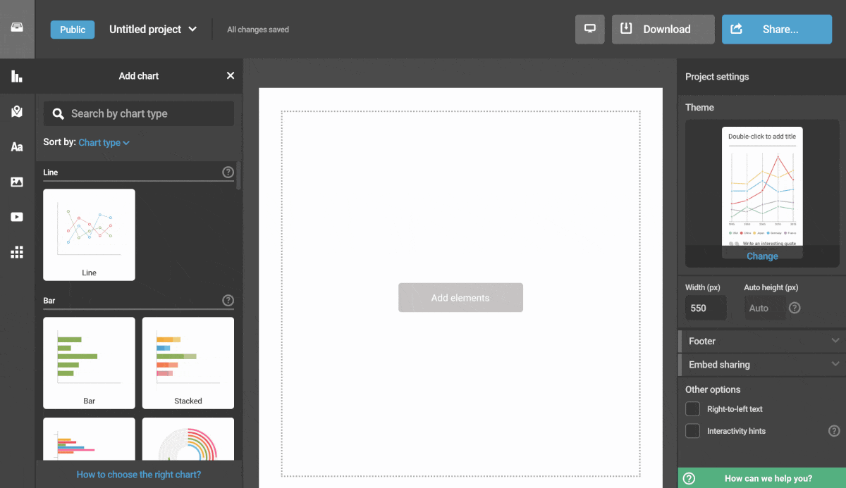
Flourish The new player in the tool landscape! Exciting. It’s neat to see Flourish evolve. Like Infogram, Flourish did what I wanted it to do. But better than Infogram, I could assign data columns to axes (typing in the column numbers requires a bit of concentration). Flourish even gave me labels, although I couldn’t get them to work well with my many bubbles. Opposite to Infogram, there wasn’t a simple “make background transparent and have no margins” options, though. I had to set the margins manually.
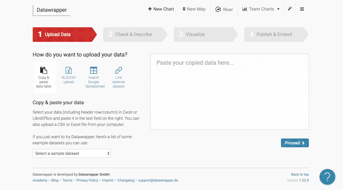
Datawrapper In case you missed it: I work for Datawrapper. They pay me. Money. With that out of the way, here’s what I (personally, privately) like better in Flourish and Infogram than in Datawrapper: I get to see a chart immediately and don’t need to go through 2 (!) steps of looking at my data in a table first. And both tools so far gave me good automatic tooltips, without needing to create them myself like I have to in Datawrapper. However, the data point labeling & the data-to-axis-assignment work better in this tool. Plus, the axis ticks are neither tilted nor too small.
This is how I created the same chart in Datawrapper for the last blog post, in June 2017:
Tableau Public
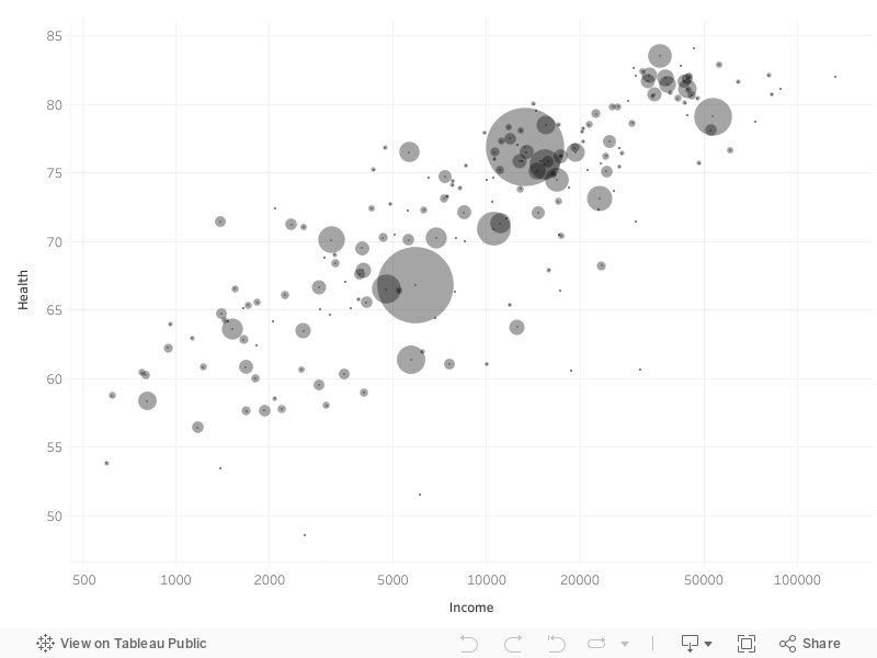
What can I say - Tableau Public works well for data like this. The embedded graphic is too massive to actually use it in an article, but it’s one of my favorite tool for exploration. Too bad I can’t save my charts in the Public version of Tableau locally: I need to upload it to the cloud. But once I do that, I can export it as a PDF and can re-use it in Adobe Illustrator…so that’s neat.

Plotly I like Plotly. It was definitely one of my favorite tools last time – but last time, I was also able to let my population column resize the bubbles. Not this time. In Chrome, the site froze; in Firefox, it showed me giant bubbles which size I couldn't change. Edit: Plotly fixed this error after the blogpost came out. The bubbles don’t resize automatically, but at least it works. Yay! (I updated the GIF below, too.) Plotly is still close to my heart, though: It handles big-ish datasets well and can create all kinds of fancy visualizations that you’d only need as a scientist (3D! Heatmaps!!).
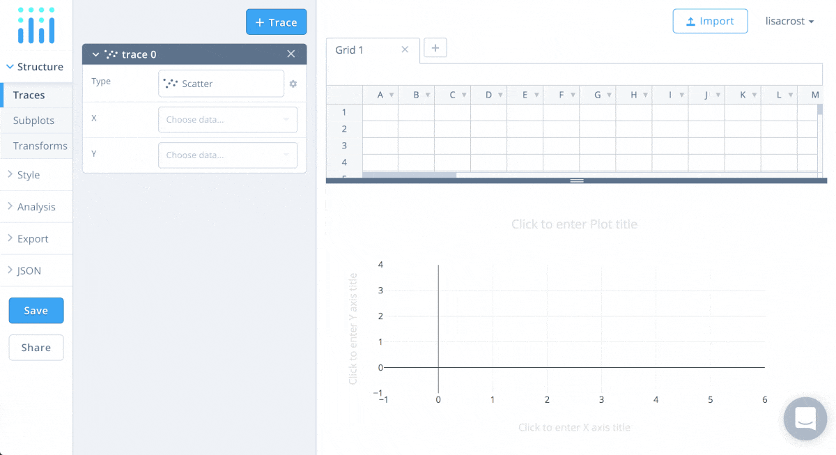
Below you can see how I created the same chart in Plotly for the last blog post, in April 2016. Assigning variables to the axes was better solved back then. In the new chart editor, I need to choose column header numbers, Flourish-style. Also, the old editor named my axes automatically (“income”, “health”). And did I mention that my bubbles sized properly back then? Good old times.
Google Sheets Let me quote from what I wrote about Google Sheets in my blog post back then: “Google Sheets CAN do bubble charts, but only with a little hack – I would have needed to change my data for it.” Well, they changed the editor. Bubble charts, here I come! Variable bubble sizes are possible now. I can’t change the color of my bubbles to one color, but hey, who cares about color. (Irony doesn’t work well online, does it.) Fun fact: Of all the chart I’ve embedded in this blog post, the Google Sheets chart is the only one that’s interactive but not responsive.
That’s how I created the same chart 2.5 years ago:
Non-embeddable Charts
Adobe Illustrator Ah, Adobe Illustrator. A tool that almost every Information Designer uses for static designs, daily. Let’s be precise here: The charting options in Illustrator suck. There’s no way to set the circle size or a log scale, but I’d just call that limited functionality. What’s really frustrating is that you can’t edit the data anymore once you decide that it’s time to properly design the chart.
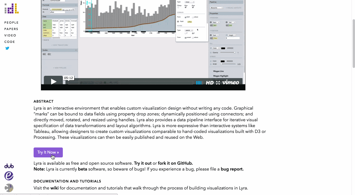
Data Illustrator There’s hope coming out of Adobe! It’s a bit weird, though: In October 2017, Bernard Kerr from Adobe showed off a new Lyra-like tool he had been working on, “Lincoln”. Seven months later, researchers from Adobe and the Georgia Institute of Technology came out with Data Illustrator. It has nothing to do with Lincoln and works almost the same: One also binds data (variables) directly to geometries. That takes some time to get used to, but I’m a big fan of the concept. The output of Data Illustrator are SVGs – perfect to keep going in Adobe Illustrator.
By the way, this is how I create the same chart in Lyra, a tool from 2014. The creation process feels more intuitive than Data Illustrator, but maybe that’s just the case for this very bubble chart. If you’re interested in these data-drawing tools, Maarten Lambrechts links to four of them here.
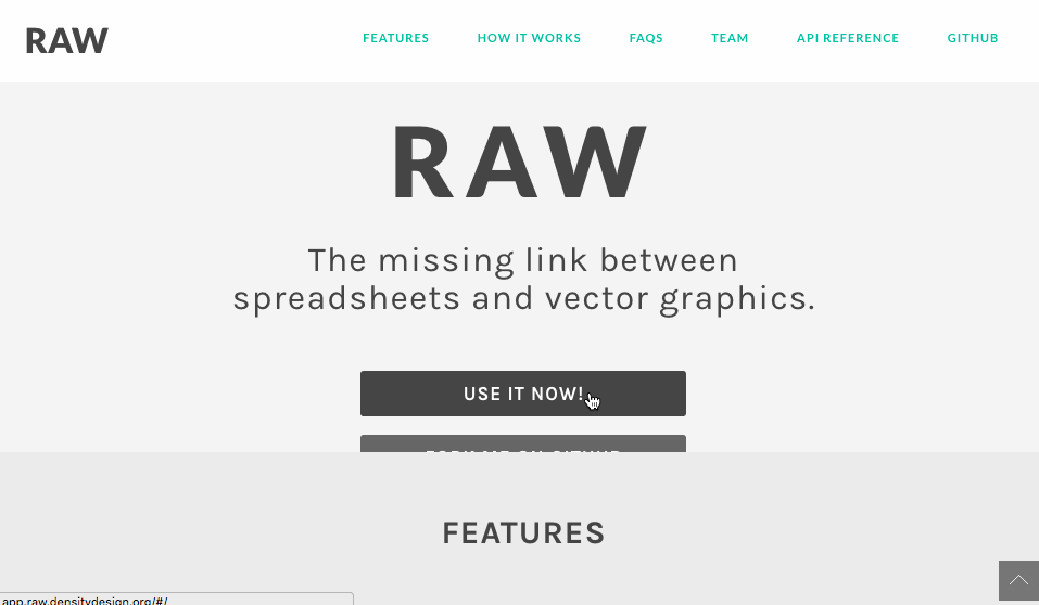
RAW by DensityDesign
I’d call RAW a super-easy-to-use extension for Adobe Illustrator: You can export fancy charts as SVG or PDF and then tweak them in Illustrator. RAW even has the option to change the size of the bubbles. Alas, no log scale. And if you just want a simple line or bar chart, RAW doesn’t have you covered.
Outtakes
Like this entire review, my selection is massively biased and subjective. In general, I focus on drag&drop charting apps with the goal of presentation, not analysis. But when I wrote the predecessor of this blog post 2.5 years ago, I reviewed seven more tools. Why did I not update my reviews for them? Here’s why:
- Lyra: I’m still 😍 about this tool, but nobody uses it and it hasn’t changed. I talk about it in the review of Data Illustrator.
- HighCharts Cloud: I’ve tried it shortly. It changed, but it’s still as bad as back then. I gave up after 3 minutes of trying to get it to show me…anything, really.
- Excel: I don’t have access to this tool anymore. I assume it’s very similar to 2.5 years ago, but I’m happy to be proven wrong. If you’re an Excel fan, please do so!
- Easycharts: Doesn’t seem to have an online version anymore.
- Quadrigram: I don’t see anyone use or mention it anymore.
- Nodebox: Also didn’t catch on / too niche.
- PoleStar, now Voyager 2: I would have loved to cover this open source tool again. Sadly, the peeps at the University of Washington Interactive Data Lab decided to discontinue developing it. Instead, they included the remains of PoleStar in the new Voyager 2 and called it a “data exploration tool that blends manual and automated chart specification.” Which is exciting for data exploration! But with the new tool, you can’t change anything slightly design-related – which makes it far less interesting for this blog post.
That’s it! Did I make a mistake or missed an important app? Let me know on Twitter: @lisacrost or via email: lisacharlotterost@gmail.com.


Comments